Jul 31, 2012

Franco-Newfoundlanders (Canada)

I've said before how much I like modern flag. Not that I dislike traditional flags, but modern flags put the creativity to next level. Today I'll present one of these flags: the flag of Francophone people in Newfoundland and Labrador, the Franco-Newfoundlanders (in English) or Franco-Terreneuviens (in French). Look at it:


These different partitions haven't place in traditional vexillology, but, in a different than modern way, a great flag like this never would take place. What I like most in this flag is the way the white and red partitions border forms a mast. Actually, many of Francophone Canadians flags has excellent designs.

Let me explain the symbolism of this flag. The flag is, obviously, based in flags of France and Acadia (French North America). The form how the partitions are divided, as I said above, simulates a ship mast. The yellow parts form the ship's flags; color is picked from Acadian flag. The ship represents the Breton, Basque and French fishermen that came to region in colonial period. The first sail holds a spruce twig (symbol of Labrador), and the second one holds a pitcher flower (provincial flower of Newfoundland and Labrador).

And you? Do you prefer traditional or modern flags? Why?

Jul 20, 2012

Curaçao (Netherlands)

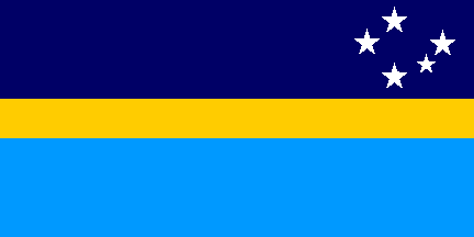
Some time ago, I said I'll post some Caribbean flags, because some of them are among the best flags in all the world. I posted the ones from Barbados and former Anguilla Republic, but now I'll posted other beautiful flag: the one from Curaçao, a Dutch dependency on Caribbean Sea. Its flag is this:


This flag exists and is in use since 1982, but gained more visibility on 2010, when Netherlands Antilles was dissolved and Curaçao gained the states of "country" under Dutch dominion. The main virtue of this flag is simplicity: just geometrical shapes, very visible and distinguishable one of others.

 The symbolism isn't much different from the others Caribbean good flags. The flag has two blue stripes: the stripe on top is for sky, the one from bottom is for sea. They're separated by a yellow stripe, symbolizing the sun that bathes island's surface.

The flag also comprises two stars on top-left canton. The bigger represents Curaçao island, bigger island on archipelago and from where the administration is settled; the second is for Klevin Curaçao island, the second bigger from archipelago. They also mean "love and happiness". According to flag creators, the star are five-pointed because the local people came from "five continents".

I hope you liked the post. Anyway, comments are welcome!

Jul 11, 2012

Unified Korea

The today's post is about map flags. Everybody have seen someday a flag with a map on it: Cyprus, Kosovo, The United Nations and also an Antarctic flag proposal (see my post about Antarctic flags), just to name a few of them. But tonight I'll relate about another map flag: that one used by a unified Korean team (formed by athletes from North Korea and South Korea) in some sportive competitions in 1990s and 2000s. They used this flag:


This flag isn't awesome. Being true, it's very boring. A white background with a map of Korean Peninsula and surrounding islands, in light blue. Why light blue? It's a color usually used to represent neutrality, because it's used by UN (I don't want to enter in discussions about UN's level of neutrality).

You may say: but why don't we use a flag that contains common elements to both Koreas, or historically used by the both. Oh, I have a flag that fit perfectly in both categories: the flag used by Josean and, after that, by Korean Empire. The flag is this:


Now, answer this question: isn't it similar to the flag used by one of the sides?

DPR Korea (North Korea)Republic of Korea (South Korea)

Anybody saying it doesn't resemble South Korean flag is lying or being ironical. I'm sure that North Korea doesn't consider this flag much "neutral". So they used the first flag, that one with the map.

So, it's the reason why I mentioned unified Korea flag. Are maps flags absolutely cool? Generally, not. Are they simple? No, they increase flag-maker's work a lot. But, in spite of all criticism, they're used, because they're neutral options, and usually every size agree with them.

Did you liked the posted? Yes? No? Please, give me feedback, and comments are the best way.

Jul 1, 2012

Tanzania

I never was a great fan of hybrid flags. In some cases, like the United Kingdom, it worked perfectly great, but in a great number of them they look very artificial and result of author's laziness and lack of creativity. Today I'll present Tanzanian flag, so delicately put together that many didn't notice it's a hybrid flag.

Tanzania was formed in 1964 by the union of Tanganyika and Zanzibar, two recently British-independent countries. Not only the name (Tan + Zan = Tanzania), but also the flag of the recently established Tanzania is a mix of the two former countries.

Republic of Tanganyika (1961-1964) People's Republic of Zanzibar and Pemba (1961)

And now note how all the elements of these flags are visible in the United Republic of Tanzania:


You can see Tanganyika flag here, but you can also see the Zanzibar flag (a little upside-down, but you do).  Pretty ingenious, isn't it? The design is so subtle that it looks like a totally original flag.

What do you think about the post? Did you know the curious origin of Tanzanian flag? Comment, please.

Jun 24, 2012

Anguilla Republic (1967-1969)

Do you know when a historic flag is good? When it's popular until today, not for what it means historically, but for how it looks. Anguilla Republic is an example.

Until 1980, Anguilla was part of a British colonial federation called Saint Christopher-Nevis-Anguilla. They used this flag (no, it's not the today's flag):


In 1967, Saint Christopher and Nevis gained  internal autonomy, but Anguilla continued to be administered by Saint Christopher, causing a rebellion that continued until 1969, during what Anguilla considered itself an independent republic. From this period, Anguilla used this beautiful flag:


A good flag can obtain different labels: classic, stately, precise... for it, I think it should be "cute". The dolphins instantaneously made local people fall in love, and I understand it perfectly. The main element in this flag are, of course, the dolphins forming a circle, symbolizing continuity. They're orange symbolizing endurance and strength. The white is for peace and tranquility, and turquoise blue is for the sea, but also for youth, faith and hope.

The rebellions wasn't successful because, as I said, the secession only occurred in 1980, but flag continued to be used locally and unofficially. In 1990, Anguilla finally adopted its official flag, resounding former republican flag, but you can see, until today, the "dolphins flag" (as it is gently known) flying along Anguilla.
I'll end this post with current Anguillan flag, whose badge is inspired in this pretty historic flag:


What's your feeling about Anguilla flag? Keep it on comments.

Jun 16, 2012

Jolly Roger flag

Pirates flags were an powerful pop icon at 20th century, and still are. A common denomination to pirate flags is "Jolly Roger", usually represented by a black field with white skull and crossbones. But it differs a bit from their historic origins.


A common pirate flag from Golden Age of Piracy (16th century) is a plain red flag (Qatar and Bahrain put white on their flags to prevent retaliation to their ships). Some histories, possibly untrue, relate that the term "Jolly Roger" comes from "jolie rouge" ("pretty red" in French). The reason is curious: in naval code, a black flag means there're prisoners at ship; a red flag means there aren't (in pirates' case, all the enemies are dead). Click here to see an authentic red Jolly Roger.

Along the time, the black flag increased of use. The color was chose because it doesn't resembles any national flag, suggesting pirates are people without homeland (similar symbolism explains the use of black by Anarchists).

Now a final explanation: skull and crossbones are commonly used by pirates, OK, but not a lot more than full skeletons, hourglasses, cutlasses and "pierced" hearts. They're all used as symbols of danger and experience.

So, if you constructed a pirate flag in your childhood, I sorrily advert you were mistaken. But children like fantasy, however.

And, in the end, a very curious Jolly Roger, from Bartholomew Roberts, showing a supposed encounter between him and the Death:

May 30, 2012

Malawi

At last May 28th, Malawi changed this flag, or better saying, returned to the model had been used for decades, since Malawi independence. The new-old flag is this:


This flag has only dark colors, what made it a little irritating to eyes. But it's only similar to Kenya flag, and not a lot to be easily confused. Before now, it was used from independence (1964) to 2010, and became a strong nationalist symbol to Malawian people. The rising sun even represents the liberation from European colonialism. The influences to this model is Marcus Garvey flag and the former Biafra flag. In 2010, the government changed the national flag to this design:


Why did they change the flag? Just to leave their mark in history. The last flag is more similar to Marcus Garvey's and Biafra flags. This sun is representing the "incredible" development in Malawi. Two rules explain the reason of popularity disaster:

  1. Not to change what's good.
  2. To change a flag produces costs.

The second rule is the most important: The first national flag was showed in car plates, and would be very expensive to replace every plate — being true, it still hasn't occurred.

And what's your opinion about the Malawi change of flag? Please, comment.

May 25, 2012

Antarctica

Antarctica hasn't a official flag. Sorry, there's a Antarctic Treaty flag, but it doesn't count. There's three hugely famous Antarctic flag proposals. Two were made by two of more famous world vexillologists: Graham Bartram, chief-vexillologist of Flag Institute, and Whitney Smith, famous principally for create the term "vexillology". The third is by Dave Hamilton.


The most famous of three is the one made by Graham Bartram, that's so used in media that it's almost an unofficial flag of Antarctica. Blue to sea, white to ice, forming Antarctic map. Simply beautiful, but we shall admit that this colors aren't the most distinguishable in polar landmark. The good point is that the flag is very neutral, and it refers directly to Antarctica.


The Whitney Smith's proposal is, at least, very visible, because of its orange color. But isn't a very good design, for me. The "A", for Antarctica, is easily removable. The map of Antarctica isn't very visible: a great number of people, at first sight, think it's a bowl — with some reason. The hands, that symbolizes the peaceful use, is a good idea, thought. At all, I think it isn't totally adequated.


The Dave Hamilton's proposal is known for being used in fake "Antarctic Dollar" notebanks. From top to bottom, the colors mean: the sky; the aurora australis; the ice and sea. The symbolism and colors are great, but the right canton hardly will be seen in that windy continent. (There's any astronomer to confirm that Southern Cross looks like that in South Pole?)

The three designs have problems, but can be worked to look cool and visible at ice at same time. What is your favorite?

What's your opinion? Do your comment!
 Looking for Antarctic flags, I found this funny Flicklr about flags.

May 16, 2012

South Africa

New governments, when take the power, often change the flags, thinking it'll change the people's feeling. I'm skeptic about it. For me, new flags can't change the people's identity, but change in people's identity can turn necessary a new flag. This occurred with South Africans: in 1994, they changed from the first flag to second:


Of course, I prefer the last. The first flag is a combination of the Dutch "Prince flag" with, in the center, miniatures of flags from United Kingdom and two former Boer republics: Orange and Transvaal. Summarily, only references to European-ethnic people.

With the end of apartheid, the South African citizenship was opened to African-ethnic people. The people's feeling was different, there was an imminent identity reconstruction over the country; the flag wasn't corresponding anymore the people identity. Quickly, it was prepared a provisional flag, that, because its enormous popularity, became permanent. It's the second flag.

The basis of this design is the former flag; if you look behind the pall, you'll see the same tricolor flag. In this case, the red tone is an intermediary between Dutch orange and English plain red. Black, gold and green are the colors from African National Congress flag, used to represent the African-ethnic population.

The presence of the horizontal pall has a special meaning: two people (represented by two legs on left) coming in same direction (the only leg in right).

If you need to present a defect of this flag, I can see a critical one: the flag has six main colors! Probably, it's the only national flag in this condition. But, it's so creative, ambitious and... South African that, if you review, you'll see why this flag still make magic!

May 6, 2012

Guernsey (United Kingdom)

Flags obtained from mixing two or more older flags are very common on "alternate history" and sci-fi websites. I have to admit that some of them have some artistic merit. But this kind of flag exists in real life (remember of Maryland), and Guernsey is a good example of when it occurs nicely.


This is a young flag: was created in 1985. This is a mix of St. George's flag, that was being used since 1936 as state flag (I don't know how the College of Arms and similar organs allowed it), with a old Norman cross, used by William the Conqueror, in the center. You can see below a deduction of how William's banner looked like:


This flag was created because Guernsey's St. George's cross was confused with English St. George's Cross, for example, at sportive competitions — it's obvious, they used the same flag!

The result, as you can see, was very good. The Guernsey flag is distinctive, easily memorized and good-looking. And it has, definitely, a pretty medieval look to a flag from 1985.