Showing posts with label North America. Show all posts

Apr 29, 2014

Alaska (USA)

Hey, Hollywood, what about a movie about the history of Alaskan flag. It has a rare history for a flag, and it happened on American territory... Well, I did my part.

The history of Alaskan flag starts with Benny Benson, a 13-years old boy with Aleutian blood. When he was three years old, his mother had died, and his father was forced to send his brother and him to orphanage. The year is 1927, and American Legion government is holding a government to decide the first Alaskan flag; more than 700 children from 7th to 12th grades submitted entries.


Benny didn't have doubts about what putting on the flags. The Big Dipper is the constellation that he looked at the sky every single night before sleeping, during all those years in the orphanage. The ratio of the flag, on his original words:
The blue field is for the Alaska sky and the forget-me-not, an Alaskan flower. The North Star is for the future state of Alaska, the most northerly in the union. The Dipper is for the Great Bear—symbolizing strength.
Benny's original design was quite similar to current flag, but had the "1867" inscription on it, that corresponds to the year of the American purchase of Alaska Territory from Russia. A modern reconstruction:


Winning the contest, he gained a US$1,000 prize, a watch and a trip to Washington, DC. He would only waste the money prize some years later, paying a professional course in diesel engines repair. Years on, he moved to Kodiak, Alaska to work as airplane mechanic; city's airport now holds his name.

Hope the history is worth the ticket... I mean, the reading. Comments are welcome!

Jan 31, 2014

The Forster Flag (USA)

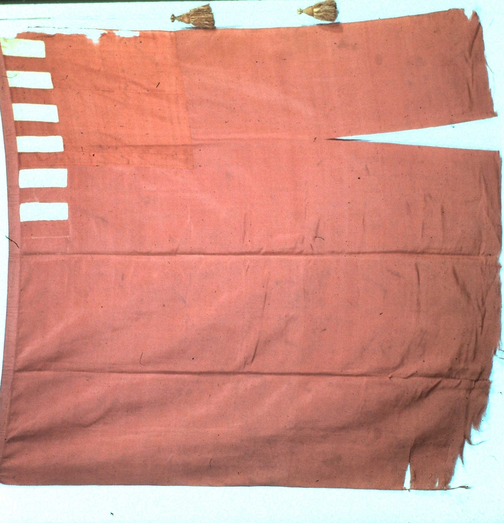
The today's review is dedicated to a flag that will soon be auctioned: the Forster Flag, also known as Forster-Knight Flag, because of its original owner families.

Here's a reconstruction of the flag (a photograph of original flag can be seen here):

It's a crimson field, with six white stripes on left hoist on obverse, and seven on reverse. A difference piece of fabric on canton proves that the flag was made from a red ensign with Union Jack removed. Its overall state is very good to an American Revolution flag, and cord and tassels have survived!

The flag will be auctioned on Doyle New York on April 9th 2014, and its estimate value is between US$ 1,000,000 and 3,000,000. The value seems too high, but a list of facts about the flag, elaborated by vexillology legend Whitney Smith to Flag Bulletin #205 (3rd bimester/2002), can justify it:

  • It's the oldest known American flag i.e. the first flag intended to represent the country;
  • It's the oldest surviving flag to represent America with thirteen red and white stripes;
  • It was carried on the battles of Lexington and Concord, the firsts of Revolutionary War;
  • It's one of 30 surviving flags used by rebel troops during the war;
  • It's one of two surviving Revolutionary flags to replace a British symbol by an American one;
  • Among the 27 war colours on USA, it's the only one that's not owned by a public museum or institution, and its ownership history since Revolutionary days is well established;
  • It was never restored but is still in good state, including the original cord and tassels;
  • It appeared on a 1999 US Post stamp series in tribute to important flags of American history;
  • And much other reasons that can found on link above.

This flag was originally owned by Samuel Forster, lieutenant of Essex Regiment, and was preserved in his family until 1975, when it was acquired by the Flag Heritage Foundation, a non-profit organization and has, since then, been the most valuable item of its collection. Its authenticity was proved many times.

If it's a so important flag, why is it in auction? Only a very good reason would justify it, and there is one: the money will be reverted in benefit to the collection of the own Whitney Smith's Flag Research Center unique and collection to be incorporated by the University of Texas at Austin, what will be very valuable to vexillology research around the world.

I certainly don't have US$ 1,000,000 to pay on a flag, so I can only wait that the future owner knows how to preserve and have good use of this true treasury of American history.

Dec 26, 2013

New England (USA)

Ho ho ho! Christmas has passed but its spirit is still on air. Christmas trees, for example, might last until January (by the way, have you ever thought about decorating your Christmas trees with mini-flags?). And few flags are so Christmassy than New England, that's red and white and have a pine tree:

The flag is evidently based on former English red ensign, to be flown, principally, by merchant ships. In Massachusetts Bay Colony, a local variant showed the flag without the cross (i.e. only a red flag with a white canton), because Puritan settlers considered the cross a symbol of "Anti-Christ".

The use of pine trees to represent New England colonies is known as early as 1686, the date of a drawing by lieutenant John Graydon (although there the tree looks like an oak tree). Possibly, the use of pine trees was inspired by "Massachusetts pine tree shilling", accepted as currency on all Northeast. Flags like the one above could be commonly found until 1707, when a proclamation by Queen Anne determined the substitution to British then red ensign. But there are sources that shows flags like this:

The New England flag was revived in 1775, by rebels during American Revolutionary War, purposely without St. George's cross:

This variant, known as "Bunker Hill flag", is often erroneously colored blue instead of red, that generated this a-historical flag copyrighted by Ebinger brothers (you can see my opinion about copyrighted flag here).

A happy 2014 to all blog readers!

Comments are welcome.

Jun 17, 2013

Hispanicity / Americas

The flag of the Hispanic people isn't widely seen, in spite of its excellent design and the official status it holds in the whole American continent. Looking at it:


The flag has a white colors, representing peace. The three crosses (known as crosses pattées in heraldry) represent the nao Santa María and the caravels Pinta and Niña, the three ships ceded to Christopher Columbus in the discovery of American continent, as well as the Christianity. They are purple, according to the author of the flag, the Uruguayan army captain Ángel Camblor, in reference to the lion of the kingdom of Leon, later annexed to the Crown of Castile, where the Spanish idiom was developed. The sun represents the Inca sun-god Inti, associated in some countries with the May Sun.

This flag is used in Spanish-speaking Latin America, Hispanic communities in North America, and in Philippines, as an ethnic flag of ethnic people. Its use is most commonly flown in Columbus Day. In those occasions, it's also known as "bandera de la raza" (i.e. "flag of the race").

Moreover, it's officially regarded, in all countries of the continent, as the "flag of the Americas" i.e. as a Pan-American flag independently of ethnic identity, since the seventh assembly of Pan-American Conference, occurred in 1933.

As I said, I think this flag should me much more popular, specially in its use as a Pan-American symbol. Although the flag's symbolism is initially associated with Hispanic ethnicity, some may say Columbus is relevant to the history of the whole continent, and that the sun can be represent the concept of "New World" (as America where known before this name was given) and the liberation process of the continent.

Your comment is welcome. Feel free to comment.

May 8, 2013

Canada

Today's post has two objectives: firstly, talks a bit about the current Canadian flag and its origin and, finally, comment a news related to this flag.

Until 1965, Canada used this flag:


Then they finally changed to current flag:


Between 1963 and 1965, occurred what was called the "Great Canadian Flag Debate", that gained popular repercussion after Lester B. Person, then prime-minister, proposed that Canada should change its flag. In the end, the right above flag won the debate.

Differently of current absolute acceptance of the maple leaf flag, there were, on the times of the adoption, a loud opposition, fearing that flag change would lead Canada to became a republic and leave the Commonwealth. Until now, fortunately or unfortunately, it never occurred.

The new Canada flag is much simpler, original and distinctive than the older flag, and became so popular that reverting it would cause popular un-satisfaction. Canada flag change happened to create what's called Canadian pale, posteriorly adopted by many Canadian territories and towns.

Now the second part, as promised on first paragraph... since Sunday (May 5th 2013), Canadian naval jack is the new naval ensign, and the naval ensign is the new jack i.e. they exchanged places. The old naval ensign, now the naval jack is the national flag; the new naval ensign (the old naval jack) is the following:


I think the change makes Canada nearer of the standard. Usually (specially on Commonwealth countries), the naval ensigns, by major influence of the United Kingdom, takes the national flag on the canton (what now happens). The jacks use to have simpler designs and, in countries where the naval ensign is different of national flag (like Canada), the national flag is the jack. So I totally agree with the change, as the things makes more sense now.

You may be questioning: what have really changed? According to international protocol, jacks are flown on the bow (front), while the ensigns are flown on the main mast (on sea) or in the stern (if the ship is anchored, moored or alongside).

Please, leave a comment. Your opinion is welcome.

Dec 15, 2012

Ohio (USA)

Today I'll talk about non-rectangular flags. The most obvious choice should be the Nepal flag, the only non-rectangular national flag in the world currently in use. As an evaluation of Nepal would present "more variables" than only its shape (look at the video and understand the joke), I'll talk about this flag other day. So I chose the second most famous flag that applies to this subject: Ohio state, in United States of America.

Look at this flag:


The flag is good at first sight, except for some considerations: there are too many stars, and they're arranged in an apparently non-logical layout - although there is explanations: look like there's thirteen stars on the left, as representing the Thirteen Colonies. There are much more symbolism, but I'll cite the five stripes for the five states of Northwest Territory (Ohio itself, Michigan, Indiana, Illinois and Wisconsin), and the big "O" that comes from "Ohio" (although it was someday confused with "Obama").

Oh, and the shape! The Ohio flag's shape resembles more what's called "burgee", generally used by yachts identification, what doesn't make it necessarily inappropriate, however. Some people say it's a kind of "charm" that makes this flag more special, while other people consider that it only turns the flag more expensive and difficult to be produced (personally, I'm part of second group). Changing this flag isn't a high-emergency goal, but it could be recommended.

To know more about flag shapes, I made a small visual dictionary:


Many types, like pennants and streamers, have variant shapes. In a better opportunity I'll post a more complete diagram.

If you have doubts about flag shapes, or only want to express any opinion, please leave a comment.

Observation: Opinions expressed by third-person sites are full responsibility of their authors. Use your critical thinking!

Oct 9, 2012

European Union v. USA and Brazil

Brazilian and American flags have a great problem in common: the number of stars. This post will talk about this issue, and how European Union took the right decision to avoid the problem.


The Brazilian flag is, by far, one of more easily distinguishable: the yellow rhombus on green field is pretty unique between the national flags. The biggest problems with it is the writing, that may ever be avoided in a flag, and a extremely complex set of 27 stars, organized between the most seem constellations in Southern Hemisphere. The number of stars reflects the 26 states and the Federal District. When the flag was first designed, in 1889, the number of stars was 21, as was the number of federated states (counting the Federal District). Since then, the flag have the number of stars changed three times. The stars and the motto makes the flag very complicated to be correctly made.

Now, we'll talk about other extreme case: the flag of United States of America (it's important to note that the first Brazilian Republican flag was inspired in this one):


The national American have is composed of thirteen horizontal stripes (seven are red and six are white) and a  blue canton with fifty stars, representing the fifty American states (the District of Columbia isn't in account). Since the design with stars were firstly adopted, in 1776, the number of stars were officially changed 26 times — the flag has been changed in an average interval of nine years! Positively fifty is a great number to any element of a flag. Compare with the famous "Betsy Ross flag", with only thirteen stars:


Wouldn't be easier if the number of stars were fixed since then? Or if this design returns? Aesthetically, yes, but probably many people would disagree. This kind of solution was adopted by European Union flag, originally adopted by Council of Europe, in 1955.


The flag consists in a blue field, inspired by the flag of Paneuropean Union (see its flag now and then), and twelve golden stars in a golden arrangement. These elements sometimes remembers the way Virgin Mary is depicted in Book of Revelations (see example), but it's hard to know if it was a real inspiration. The first proposal had fifteen stars, because then this was the number of member states of Council of Europe, but one of the members, the Saar Protectorate, was a disputed area, and West Germany objected the start for Saar. So they fixed the number of stars in twelve, because the number symbolizes perfection and has no special political connotation.

What's your opinion about the flags presented there, or the post content? Your comment is welcome!

Aug 22, 2012

Greenland (Denmark)

Today's post is about a very interesting design technique, used both in flags and coat of arms: the "counterchanged" effect. What is this? It's easier explain with an example, and I chose a great and famous one: Greenland!


In this case, it's said that red and white are counterchanged. When using contrasting colors, like these, it's a dynamic way of make them become even more contrasting. A simple and original design, like this, is the reason to this beautiful flag.

And a additional detail makes it simply extraordinary: there's a good symbolism behind! At first sight, the flag resembles the sun fading on horizon and being reflected by the sea. And the flag creator admits other meanings: the white stripe for glaciers and ice cap, the red stripe for the ocean, the red semicircle to the sun, and finally the white semicircle to icebergs. Simply genial!

Extra: the Greenlandic flag was adopted in 1985, when the above flag received 14 votes. The runner-up ended with 11 votes. This is the flag that ended in second place:


It's an interesting flag, too. Greenland flag is the only national Nordic flag currently doesn't using the Nordic cross, but this second proposal uses. The color meaning is interesting: white for ice and green is canting island name: Greenland ("green land"). There're rumors, that I can't personally confirm, that while current flag is used principally by Inuit, the Danish-descendant prefer this proposed flag. If it's true, reasons are clear!

Did you like the post? Do you want to express your opinion about any of these flags? Leave a comment, please. Thank you for reading!

Jul 31, 2012

Franco-Newfoundlanders (Canada)

I've said before how much I like modern flag. Not that I dislike traditional flags, but modern flags put the creativity to next level. Today I'll present one of these flags: the flag of Francophone people in Newfoundland and Labrador, the Franco-Newfoundlanders (in English) or Franco-Terreneuviens (in French). Look at it:


These different partitions haven't place in traditional vexillology, but, in a different than modern way, a great flag like this never would take place. What I like most in this flag is the way the white and red partitions border forms a mast. Actually, many of Francophone Canadians flags has excellent designs.

Let me explain the symbolism of this flag. The flag is, obviously, based in flags of France and Acadia (French North America). The form how the partitions are divided, as I said above, simulates a ship mast. The yellow parts form the ship's flags; color is picked from Acadian flag. The ship represents the Breton, Basque and French fishermen that came to region in colonial period. The first sail holds a spruce twig (symbol of Labrador), and the second one holds a pitcher flower (provincial flower of Newfoundland and Labrador).

And you? Do you prefer traditional or modern flags? Why?