Oct 16, 2012

Element of flags: color palettes

When you're talking about flag, "coincidences" sometimes aren't what they look like. Many times a flag is intentionally similar to another, when the first taking the second as inspiration. An example easy to notice and study are the color combinations. Some flags are very influential, in the sense that's took as base to many newer flags. Here you can see some of them, grouped by the inspiration.

Pan-African colors


There's two palettes of colors known as pan-African colors: one is composed by red, yellow and green, while the other contains red, black and green.

The first set of color (green, yellow and red) is inspired by the flag of Ethiopian Empire.


This three colors have been specially used in Ethiopia since about 17th century, but the flag was only adopted in 1897. The meaning of the colors is disputed, but generally it's said that red is for the blood spilled in defense of Ethiopia , yellow is for the peace and harmony between Ethiopian ethnic and religious groups, and green for hope or land's fertility. The insignia in the middle of the flag is the Lion of Judah, used because the Ethiopian Dynasty claimed to have ancestry from King Solomon and Queen of Sheba, being named Solomonic Dynasty.

As Ethiopia, with exception of a brief period of Italian rule, resisted strongly to European colonization, many countries adopted this colors when gained independence from European countries, as symbol of sovereignty. They are also much used by the Rastafari Movement.

Other set of colors also known as "Pan-African colors" are composed by red, black and green, derived from UNIA (Universal Negro Improvement Association) flag.


The UNIA was founded by Afro-American activist Marcus Garvey, in 1920. It's commonly said that red stands for African blood, black for the African people and green for continent's fertility. It was adopted as an   unofficial "Afro-American" flag and many African countries inspired in it to create their own flags.

Countries in Americas with great African-descendant population, e.g. St. Kitts and Nevis and Grenada, also adopted pan-African colors. See a small flag chart with some African countries with pan-African colors in their flag history:


[Click on images to zoom]

Pan-Slavic colors


Other great flags family is from pan-Slavic. They use the colors red, white and blue. It's important to notice that not all flags with these colors has pan-Slavic inspiration (like France, USA and UK). They are inspired by the flag approved by Pan-Slav Congress of 1848 (occurred in Prague). The colors, associated with freedom and revolution (e.g. French flag) and the same of Russian flag, were chose in a great number of Slavic countries. See the pan-Slavic flag and a flag chart with flags inspired by it.


Pan-Arab colors


Here's a challenge: can you say right now, without assistance, the differences between Kuwait and Jordan flags? You probably don't; if you can, congratulations, because flags of some Arab countries are very hard to be distinguished by non-Arabs. The reason is simple: they all have the same matrix, in this case the flag used during the Arab Revolt (1916-1918). Look at the flag:


The Arab revolt was an attempt to create an unified Arab country under territories of Ottoman Empire (ruled by ethnic Turks). The flag used during the revolt, considered Arab nationalist, was immediately adopted as symbol of Arab identity. See a set of recognized and unrecognized countries that adopt this colors:


It's important to notice that non-Arab Muslim countries, like Afghanistan and Pakistan, don't adopt this colors.

Pan-Iranian colors


Many flags are commonly thought to represent the pan-Arab colors, but actually represents the pan-Iranian colors, used by Persian people, majority in Iran, Tajikistan and Afghanistan. They're based in Persian flag (nowadays Iran); this one is from before 1906 (date unknown).


The small flag chart below show some flags using pan-Iranian colors:


Colors of Federal Republic of Central America


The Federal Republic of Central America (1823-1838) was a good attempt to hold together previous Spanish colonies in Central America, but the union disbanded, although until today they have friendship relationships and there were other attempts of reunification, e.g. the Greater Republic of Central America (1896-1898). See the flag of the Federal Republic:


The color of these flags are blue and white (Costa Rica added the red).


Colors of Gran Colombia


Finally, the last color-based flag family. In a similar case to Central America, the ex-constituent countries of Gran Colombia (officially Republic of Colombia; 1819-1831) adopted the colors of these countries. The unification ideology, influenced by the ideas of liberator Simón Bolívar, is having some voice last years. Gran Colombia used many flags, being the flag below the first and most famous of them:


The colors that defines this family are yellow, blue and red. Bolivia changed the blue by the green. See the flags of this family:


Ending...


This was a long post. Don't you think I deserve at least one comment? Please, if possible, subscribe to the blog. Thank you for reading!

Oct 9, 2012

European Union v. USA and Brazil

Brazilian and American flags have a great problem in common: the number of stars. This post will talk about this issue, and how European Union took the right decision to avoid the problem.


The Brazilian flag is, by far, one of more easily distinguishable: the yellow rhombus on green field is pretty unique between the national flags. The biggest problems with it is the writing, that may ever be avoided in a flag, and a extremely complex set of 27 stars, organized between the most seem constellations in Southern Hemisphere. The number of stars reflects the 26 states and the Federal District. When the flag was first designed, in 1889, the number of stars was 21, as was the number of federated states (counting the Federal District). Since then, the flag have the number of stars changed three times. The stars and the motto makes the flag very complicated to be correctly made.

Now, we'll talk about other extreme case: the flag of United States of America (it's important to note that the first Brazilian Republican flag was inspired in this one):


The national American have is composed of thirteen horizontal stripes (seven are red and six are white) and a  blue canton with fifty stars, representing the fifty American states (the District of Columbia isn't in account). Since the design with stars were firstly adopted, in 1776, the number of stars were officially changed 26 times — the flag has been changed in an average interval of nine years! Positively fifty is a great number to any element of a flag. Compare with the famous "Betsy Ross flag", with only thirteen stars:


Wouldn't be easier if the number of stars were fixed since then? Or if this design returns? Aesthetically, yes, but probably many people would disagree. This kind of solution was adopted by European Union flag, originally adopted by Council of Europe, in 1955.


The flag consists in a blue field, inspired by the flag of Paneuropean Union (see its flag now and then), and twelve golden stars in a golden arrangement. These elements sometimes remembers the way Virgin Mary is depicted in Book of Revelations (see example), but it's hard to know if it was a real inspiration. The first proposal had fifteen stars, because then this was the number of member states of Council of Europe, but one of the members, the Saar Protectorate, was a disputed area, and West Germany objected the start for Saar. So they fixed the number of stars in twelve, because the number symbolizes perfection and has no special political connotation.

What's your opinion about the flags presented there, or the post content? Your comment is welcome!

Oct 2, 2012

Arica y Parinacota (Chile)

Some weeks ago I read a news that gave an idea to a new post on this blog: Microsoft, one of biggest enterprises in the world, changed its logo. Look at the new logo:


You may be thinking: OK, but what this have to do with flags? I can better answer you with a flag: the one of Arica and Parinacota Region, in Chile.


It seems like Microsoft copied Arica and Parinacota logo or, more probably, the creators of the flag predicted some design trends. The two are recent: the province was only created in 2007.

This example shows perfectly that a flag can be a design piece. Unfortunately, this also shows that flag-making rules aren't necessarily identical to design rules. For example, writing is something that somebody with vexillologic knowledge would avoid.

In other hand, this model can be used as problem without major problems: some elements of the place are shown (llamas, a colonial building, a beach and mountains). It's distinguishable and can be used in many occasions (see the regional Manual of Graphic Norms). At least, still this design become old-fashioned: see the flag of Newfoundland and Labrador and you'll know better the problem — being sincere, probably Labrador and Newfoundland flag never looked good.

Thank you for reading. Every comment is welcome.

Sep 24, 2012

Switzerland

Who owns a flag? Technically, with exception of private flags, about 90% of all flags are in public domain, i.e., the subject represented by the flag doesn't gain royalties by the use of it. It's the main reason flags can be seen everywhere: at Internet, on magazines and newspapers, etc., although commonly they're protected of being used in merchandises, but you still can see it.

Today I'll speak about a successful example: Switzerland. See the flags (first is national flag, second is the civil and state ensign):

The flag of Switzerland is good: simple, easy to be remembered. And it's almost impossible not associate the Swiss flag with this symbol-products: Swiss Army knives, clocks, chocolate. For instance, look at the trademarks of two official Swiss Army knives manufacturers: Victorinox and Wenger.

If it's right or not, it's not the question; the truth is that flags, principally when they're easily distinguishable, can still favor national economy!

Did you liked the post? No? Your opinion is welcome on comments. By the way, answer me: in your country, is there any enterprise that associates its products to national flag?

Sep 19, 2012

Nauru

The today's flag is very beautiful and has an awesome symbolism: it's Nauru, an island in Pacific Ocean that constitutes a country only bigger than Monaco and Vatican City. However, its flag is worthy of a great nation!


This flag has many characteristics of a great flag: good geometric layout, contrasting colors, simplicity, originality, etc.

It's alright, isn't it? Now let me talk a little about Nauru flag history and symbolism. It was adopted in 1968, being designed by an Australian flag manufacturer. The blue represents, in some way, the ocean. The yellow line represents the Equator, and the white represents the island position just below the Equator. The star is white, representing the phosphate — the great wealth of island in the past —, and is twelve-pointed as expressing the twelve original tribes that have inhabited the country.

What's your opinion about Nauru flag? Please, leave your comment.

Sep 9, 2012

Element of flags: The Southern Cross

Today I'll write about the Southern Cross (also know by its scientific name, "Crux"), a symbol present in flags, coat of arms and other design issues from everywhere in Southern Hemisphere. Maybe, you, in Northern Hemisphere, want to know: what do you see in special in Southern Cross? Myself, a Brazilian, could answer: everything.


[Note: This flag is from Cruzeiro do Sul, Acre, Brazil. For me, the simplest demonstration of Crux majesty]
Firstly, it's important what the Southern Cross means: the South, its ancestors and its lands. During the Antiquity, it was visible in southern Europe and other similar locations. But, in the transition to Middle Ages, approximately, the change of Earth axial inclination hided it until, at least, some thousands of years.

The first time the Southern Cross was saw again by an European was in 1500, during the Discovery of Brazil, by Portuguese astronomer João Faras. Since then, navigators adopted the Crux in the same way the land natives was using it since immemorial times: as a reference mark to Southern Pole (my post about Antarctic flags shows one flag refering to this fact). And it's as a symbol of geographic position that the Southern Cross is used in flags, etc. See a small gallery with some of these flags:


[Click on image to zoom]
The Southern Cross is frequently seen in flags of Argentina, Australia, Brazil, Chile, New Zealand, Papua New Guinea, and Samoa, and it's featured in many of Australia and New Zealand proposals to new flags.

I'm a great fan of Southern Cross, but I must to tell a bad note: the Southern Cross is tattooed, in Australia, with a connotation of  nationalism that sometimes comes near xenophobia. However, I think until many Australia recognizes the Southern Cross as the incredible symbol it is.

If you want to give your opinion about the post or the Southern Cross use in flags, feel free to comment. Thank you!

Aug 30, 2012

Albania, Kingdom of Jerusalem

Today post is about rule of tincture, a tradition that came from heraldry but that everyone interested in flags design will need to know someday. Basically, it says that a color can't be placed over a color, and a metal can't be placed over a metal. Firstly, it's needed to know the heraldic concepts of color and metal.

Light tinctures, i.e. white and yellow, are considered metals. Darker tinctures, i.e. red, blue, green, purple and black, are called colors. Non-traditional tinctures use to be classified as colors, but some scholars defend the sky blue, buff-color and some metallic colors (e.g. iron, steel, bronze) are being metals .

The rule of tinctures is rigidly followed in United Kingdom and Anglophone countries. Nevertheless, in continental Europe, it's mostly used as a aesthetic recommendation, being exceptions more common there. I'll mention and explain two cases of broken rule, one of each case.


It's just a conjectural flag: maybe it was white over yellow instead of yellow over white, and the smaller cross could exist or not. Whatever it broke the rules of tinctures: yellow and white are both heraldic "metals". But there's some freedom in this case: the Kingdom of Jerusalem was a medieval crusader kingdom, so the combination of yellow and white was accepted just because of religious purposes (repair they're Vatican colors).


The rule is also broken in Albanian flag, but for inverse reason: it's considered, by heraldic scholars, "color" over "color". However, Eastern European tradition admit this: there's the marten and zibelline tinctures, looking exactly like red (gules) and black (sable), respectively, but treated as "furs" (a kind of heraldic texture), considered neutral to the rule.

By the way, a little explanation about Albanian flag history: the black double-head eagle over red background was present on the coat of arms of Kastriot family — George Kastriot Skanderbeg fought against Ottoman domination in XV century. In 1912, Albania gained independence from Ottomans again, and the model was remembered, and it has been used, with small changes, since then.

Did you like this post? Do you want to comment about Jerusalem or Albania flags? Have any doubt about the rule of tinctures? Leave a comment, please.

Aug 22, 2012

Greenland (Denmark)

Today's post is about a very interesting design technique, used both in flags and coat of arms: the "counterchanged" effect. What is this? It's easier explain with an example, and I chose a great and famous one: Greenland!


In this case, it's said that red and white are counterchanged. When using contrasting colors, like these, it's a dynamic way of make them become even more contrasting. A simple and original design, like this, is the reason to this beautiful flag.

And a additional detail makes it simply extraordinary: there's a good symbolism behind! At first sight, the flag resembles the sun fading on horizon and being reflected by the sea. And the flag creator admits other meanings: the white stripe for glaciers and ice cap, the red stripe for the ocean, the red semicircle to the sun, and finally the white semicircle to icebergs. Simply genial!

Extra: the Greenlandic flag was adopted in 1985, when the above flag received 14 votes. The runner-up ended with 11 votes. This is the flag that ended in second place:


It's an interesting flag, too. Greenland flag is the only national Nordic flag currently doesn't using the Nordic cross, but this second proposal uses. The color meaning is interesting: white for ice and green is canting island name: Greenland ("green land"). There're rumors, that I can't personally confirm, that while current flag is used principally by Inuit, the Danish-descendant prefer this proposed flag. If it's true, reasons are clear!

Did you like the post? Do you want to express your opinion about any of these flags? Leave a comment, please. Thank you for reading!

Aug 15, 2012

Estonia, Ukraine

Today I'll post something about flags representing landmarks, a technique that commonly generate good flags. Currently, at least three independent nations use landmark flags: Estonia, Kiribati and Ukraine. In local spheres, they're also very used. This post will be focused on Estonia and Ukraine, my favorite flags in this criteria.

Ukraine


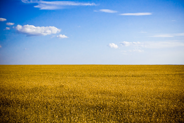
The yellow and blue has been associated with Ukraine for centuries, and there's no register of what this originally represents. The current flag was adopted in 1992, after USSR broke-up, but a very similar model was used soon after World War I. In modern times, blue is associated with sky, while yellow is for wheat fields. See a typical Ukrainian landmark that explain this interpretation:


Estonia

More interesting example is Estonian flag:


A historic interpretation gives an alternate explanation to the colors: blue for ancient freedom, black for lost independence and white for a brighter future. Other interpretations exist, however. And some Estonians associate it to the winter landmark in the country: blue is sky, black the tree without leaves and white the snow floor. See a truly Estonian image:


Do you liked the post? Want to show your liking for another flag with landmark? Write me a comment, please.

Aug 7, 2012

Japan

Today I'll denounce what is, for me, a historic injustice. Some people use to say "I'm lazier than the man that created Japanese flag". The Japanese flag is simple, but not silly, and I'll demonstrate it below. Now, let's see Japanese flag:


The Japanese flag consists of a red circle over a white background. The circle represents the sun, so the flag is know as Nisshōki ("sun-mark flag") or, more popularly, as Hinomaru ("sun circle" or "circle of the sun"). Why is this perfect to Japan? Because Japan = Sun. Let me explain better. In Japanese, the country is known as Nippon or Nihon, both meaning "sun's origin". The word "Japan" comes from Mandarin Cipan, that means "country of sun's origin". With translation to many languages, the country is known as "The Land of Rising Sun". Is there something better than a red circle to represent Japan? Maybe, but I don't know what.

An extra: The Japanese "Rising Sun" flag.


It's far better than Japanese national flag, almost plain. It's something like an improvement of anterior flag. But probably it'll never be adopted as national flag, and the reasons are many. It was used, until the end of World War II, as Japanese Empire war flag. So, in Japan, it's a symbol of far-right and, in neighbors countries, symbol of militarism and imperialism. An asymmetric version of this flag is still used by country's Navy. Unfortunately, the history doesn't honor the design.

I want to know your opinion about Japanese flag. Do you think it's a good flag, or that its creator is only less lazy than the previous Libyan flag's one? Give your comment.