Ceuta is a Spanish exclave in Northern Africa (more precisely, Morocco), a rare reminiscent of centuries of colonization. And with a puzzling flag.
This is the flag of Ceuta:
As I said, Ceuta is considered part of Spain. But the coat of arms in flag is Portuguese, right? More or less...
Yes, it's practically identical to Portuguese coat of arms, and History explains it: Ceuta used to be a Portuguese colony; between 1580 and 1640, Portugal was united with Spain due to dynastic reasons and, after that, Ceuta was the only former Portuguese colony that chose to stay under Spanish rule.
No, it's not identical to Portuguese coat of arms, but the difference is subtle: the current Portuguese coat of arms has the seven towers arrenged 3-2-2, while Ceuta has the towers arranged 2-2-2-1.
But the Portuguese influence in Ceuta flag is even bigger. That's the flag of Lisbon, capital of Portugal:
The similarity is not coincidence: in 1415, when Portugal conquered Ceuta, the flag flown was that of Lisbon's patron saint St. Vicent (like above, but with coats of arms), apparently inspired by the heraldry of Dominican Order, important for Lisbon history.
In 20th century, the flag of Lisbon gyronny pattern become the standard for Portuguese cities, so the links between Portugal and the flag of Ceuta only grew.
Comments and suggestions are welcome.
Dec 27, 2015
Oct 3, 2015
New Zealand [five finalist proposals]
This November 20th, a new step in New Zealand flag referendum will be started: choosing the design that will compete with current flag the next.
There were four designs originally announced, but a fifth design was added.
The first design was made by Alofi Kanter:
I think it's pleasing for the eyes, and a big pro is the similarity with traditional silver fern flag, used by NZ in sports and other contexts. The silver fern is New Zealand's national plant and, possibly, its main national symbol. Maybe, due to its inspiration in NZ government branding, it looks too logo-ish.
The second design, by Kyle Lockwood was surfaced around 2003 and, having gained much popularity since then, it's place in final five is no surprise:
The key for its suceess is the link to current flag and british red-white-blue, but still showing the silver fern.
The third is by Kyle Lockwood, too. This design replaces red with black, as black and white are (together with red ochre) the national colors of the country, being a viable mix of current national flag and silver fern flag.
The fourth design was presented by Andrew Fyfe:
This design contains a reference to koru, a germinating silver fern that's an important symbol in Māori culture. It also resembles a wave, a cloud (one New Zealand's Māori name is Aotearoa, "the land of long white cloud") and ram's horns. It's my least favorite design of the five.
Originally, the final shortlist should countain only four flags, but a fifth design was add by popular pressure. This design was presented by Aaron Dustin:
This design, nicknamed "Red Peak Flag", has many inspiration, among them New Zealand's geography, the Union Jack and Māori creation myth (also represented in Tino rangatiratanga). Curiously, it's similar to a flag that won a private contest some months ago.
I like some of those designs more than others, but I think any of them can compete with NZ current flag with own merits. Whichever flag will the referendum, I'll probably have already reviewed it —pretty efficient, right?
Comments and suggestions are welcome.
This post should be posted in September, but I had technical issues. I'm sorry.
There were four designs originally announced, but a fifth design was added.
The first design was made by Alofi Kanter:
I think it's pleasing for the eyes, and a big pro is the similarity with traditional silver fern flag, used by NZ in sports and other contexts. The silver fern is New Zealand's national plant and, possibly, its main national symbol. Maybe, due to its inspiration in NZ government branding, it looks too logo-ish.
The second design, by Kyle Lockwood was surfaced around 2003 and, having gained much popularity since then, it's place in final five is no surprise:
The key for its suceess is the link to current flag and british red-white-blue, but still showing the silver fern.
The third is by Kyle Lockwood, too. This design replaces red with black, as black and white are (together with red ochre) the national colors of the country, being a viable mix of current national flag and silver fern flag.
The fourth design was presented by Andrew Fyfe:
This design contains a reference to koru, a germinating silver fern that's an important symbol in Māori culture. It also resembles a wave, a cloud (one New Zealand's Māori name is Aotearoa, "the land of long white cloud") and ram's horns. It's my least favorite design of the five.
Originally, the final shortlist should countain only four flags, but a fifth design was add by popular pressure. This design was presented by Aaron Dustin:
This design, nicknamed "Red Peak Flag", has many inspiration, among them New Zealand's geography, the Union Jack and Māori creation myth (also represented in Tino rangatiratanga). Curiously, it's similar to a flag that won a private contest some months ago.
I like some of those designs more than others, but I think any of them can compete with NZ current flag with own merits. Whichever flag will the referendum, I'll probably have already reviewed it —pretty efficient, right?
Comments and suggestions are welcome.
This post should be posted in September, but I had technical issues. I'm sorry.
Aug 27, 2015
Cuba
One flag-related event that happened this month was the re-opening of American embassy in Cuba and Cuban embassy in USA, with their historical flag-hanging ceremonies.
I think this event vexillologically fascinating, because the Cuban flag is probably inspired in American flag. The theory is the following: Narciso López, a Venezuelan filibuster exiled in New York, engaged in Cuban struggle for independence in 1840s and 1850s. He carried the flag that would became modern Cuban flag, taking as inspiration the French and the American flag, as well as Freemason triangle. (According to some historians, López's plan ended with the island annexed by the USA.)
The most curious: the Cuban flag is an admitted inspiration for the flag of Puerto Rico, that ended annexed by USA...
...As López wanted to happen to Cuba.
That's it! Comments are welcome.
Jul 30, 2015
New Zealand [Studio Alexander's proposal]
The New Zealand flag referendum is soon to happen — next September, the four finalists will be selected. Meanwhile, economist and philanthropist Gareth Morgan organized a private contest for proposals of new NZ flags by "genuine designers". The winner entry was design by Auckland-based Studio Alexander.
This is the current New Zealand flag:
And this is $20,000 worthy winner entry, called wā kāinga (in Maori, something like "homeland"):
The design is not bad per se, but has received some critics for not including New Zealander symbols like the silver fern or the Southern Cross. The red triangle represents the Maori heritage, while the blue triangle stands for the British heritage, The black color is a NZ symbol independent of ethnicity, so represents country's multiculturalism (I think it's just curious that black is the union of all colors). The white shape is derivative from the maihi, a Maori bargeboard, and unites the other three colors.
Additional symbolism includes the similarity with Union Jack and Tino rangatiratanga, and the black triangle, that relates to the many mountains on the islands.
What do you think about this design? Comments are welcome.
Jun 30, 2015
Fiji [2015 finalists]
This June 30th, the public feedback channel of the 23 finalist designs will be closed and another round of the adoption of new Fijian national flag will start: the feedback will be sent to Parliament, where the new flag will be debated and chosen before October 10th, Fijian Independence Day.
This is the current Fiji flag:
It isn't an ingenious design, but the light blue of Pacific stands out. Having become a republic in 1987, the current Fiji government wants to drop the Union Jack, related to its colonial past.
From over 2,000 designs, a committee chose 23 designs, most of them mash-ups of different entries. As you can see, all entries contain the "Fiji blue", often combined with dark blue. Click to zoom:
The "mash-up" thing is evident: many entries follow the same pattern, possibly as a result of the initial intent of choosing only five designs. Entries 36 to 39, 46 and 52 to 53 follow the same dark-blue-triangle-on-hoist pattern; among them, I think #46 is the only one that's not too cluttered and work. You can see an abstract pattern in entries 42 to 44 and 56 to 57 and another on designs 40 to 41 and 54 and 55, and I'm not a fan of neither,
From remaining designs, we have #35, that's OK but not iconic enough for a national flag, the rest of them I think would be excellent choices, too. Among all, my favorite is design #47:
Now I have to speak a bit about the symbolism on all entries:
It's importance to notice that Parliament can finally choose a design not among the 23 finalists, but popular feedback on those designs will be part of the debate. As soon as the final design is chosen, I'll send updates,
Comments and suggestions are welcome!
This is the current Fiji flag:
It isn't an ingenious design, but the light blue of Pacific stands out. Having become a republic in 1987, the current Fiji government wants to drop the Union Jack, related to its colonial past.
From over 2,000 designs, a committee chose 23 designs, most of them mash-ups of different entries. As you can see, all entries contain the "Fiji blue", often combined with dark blue. Click to zoom:
The "mash-up" thing is evident: many entries follow the same pattern, possibly as a result of the initial intent of choosing only five designs. Entries 36 to 39, 46 and 52 to 53 follow the same dark-blue-triangle-on-hoist pattern; among them, I think #46 is the only one that's not too cluttered and work. You can see an abstract pattern in entries 42 to 44 and 56 to 57 and another on designs 40 to 41 and 54 and 55, and I'm not a fan of neither,
From remaining designs, we have #35, that's OK but not iconic enough for a national flag, the rest of them I think would be excellent choices, too. Among all, my favorite is design #47:
Now I have to speak a bit about the symbolism on all entries:
- The light blue, as I previously told, is a link to current flag, and represents the Pacific Ocean, but also peace, serenity, freedom and the solidarity among all island nations.
- Yellow is sun's color, thus represents radiance, life, sustenance and a new beginning. The sun stands for the same things, but also the warmth of Fijian people.
- Dark blue represents peace, prosperity, trust, dignity and intelligence, while red stands for the passion, strength and energy of Fijian people.
- The triangle on hoist represents moving forward as a single people.
- Stars represent guidance, navigation and direction. The number three represents the three branches of government (executive, legislative and judiciary), while seven is a number considered of good omen by most Fijians.
- The Tagimoucia is a flower that only grows in Fiji, and is considered a symbol of blessings, peace and courage; the turtle represents humility, strength, patience and perseverance; the davui (conch shell trumpet) stands for community and respect, thus national unity; the drua represents Fiji's past, present and future, and the nation moving united towards future; tapa (cloth pattern) is a sign of Fijian heritage; and the coconut tree stands for sustenance and versatility.
It's importance to notice that Parliament can finally choose a design not among the 23 finalists, but popular feedback on those designs will be part of the debate. As soon as the final design is chosen, I'll send updates,
Comments and suggestions are welcome!
May 28, 2015
Planet Earth [Oskar Pernefeldt's proposal]
One of biggest flag-releated news to pop on world's internet this month was the proposal of "The International Flag of Planet Earth", by a Swedish designer named Oskar Pernefeldt. According to the official site, it was designed as a graduation project.
Have you seen this design?
I sincerely like the design, even though it's a bit complicated.
According to the site, the objective of the flag is being used to raise awareness and represent the Planet Earth as a whole — one given example is an international earthling colony in Mars!
The blue color is iconic of Earth since, at least, the famous Yuri Gagarin's speech. Its bright blue shade was chosen to stand out against both space's darkness and white shiny space suits and ships. The seven rings represent the seven continents, and are arranged as Borromean rings i.e. one ring can't be removed without collapsing the whole structure.
One special note: when I learned about the "seven continents" thing, I, being South American, immediately associated it to Africa, Asia, Europe, Oceania and... North America, Central America and South America! Being the designer Swedish, they more probably were North America, South America and Antarctica.
By the way, design and rationale are a bit reminiscent of Olympic rings, aren't they?
Comments are welcome!
Apr 30, 2015
Church pennant (United Kingdom, Netherlands)
Church pennants are used in warships to denote, usually, that its staff is on religious service or funeral. In signal of respect, it's avoided to send any kind of messages to ships flying the church pennant, except in emergency.
Today I'll present one interesting flag mystery: Why are the British and Dutch church pennants identical? They look like this:
In both countries, the pennant is constituted by St. George's cross in the hoist and Dutch tricolor in the fly. Its use is reported as early as the 1670s.
But why the Dutch church pennant is identical to British church pennant, after all? A version tells that, at least once during the Anglo-Dutch Wars (second half of 17th century), both sides agreed on a temporary cease fire to religious services. Unfortunately, there's no confirmation if it's truth or myth.
A different version says that it's linked William of Orange's flag as King of England (William III), here on a reconstruction by Klaus-Michael Schneider:
Whatever is the origin, it's nice to notice how it survived in both sides of the North Sea to our days. (Just notice how it still used English instead of British flag.)
Comments and suggestions are welcome!
Mar 31, 2015
Māori people (New Zealand)
Now and then, the flag of the Māori, native Polynesian people from New Zealand, appears in media. These time, in the course of NZ flag debate, due to the upcoming referenda — even tough that design probably won't be considered, as it originally represents an ethnic group of the country, not the country as a whole.
This is the most famous Māori flag:
The colors of the flag — black, red (actually, red ochre) and white — are the official colors of the country, what many people out of the island don't know. The color symbolism in the flag is very significative: the black color presents the Te Korekore (the absolute nothingness) and Rangi (the heaven, the sky-father); red represents Te Whei Ao (coming into being) and Papatuanuku (the earth-mother); white stands for Te Ao Marama (realm of being and light), purity, enlightenment and harmony.
The design thus symbolize the Māori creation myth surrounding Rangi (the sky-father) and Papa (the earth-mother), as well as an ideal of harmony, in a very graphic and elegant way. The spiral pattern is similar to a koru and can remark the New Zealand's name in Māori language: Aotearoa, "the land of the long white cloud".
This flag is known as Tino rangatiratanga, an expression hard to be translated, but often did as "absolute sovereignty". This flag was designed by Hiraina Marsden, Jan Smith and Linda Munn, in 1990.
As I said in first paragraph, I have no hopes that it will become the next NZ flag, but the vexillologist inside myself would be more than happy if a design as beautiful as this was chosen.
Comments and suggestions!
As soon as the designs chosen for the referenda were announced, I'll return to the trend.
Feb 28, 2015
Ireland, India
You may have noticed that both India and Republic of Ireland national flags are green and orange. But there are much more coincidences among the flags.
The flag, however, gained new symbolism. In the words of Sarvepalli Radhakrishnan, that would later became the second Indian president:
The tricolor flag of Republic of Ireland dates back from the first half of XIX century, but was revived for the Easter Rising (1916) and the Irish War of Independence soon after.
The orange represents the Protestantism (a reference to King William III of Orange, that inspired many Protestant banners), while the green represents the Catholicism (associated with Gaelicism). The white standed for the peace between that two religions...
Society of United Irishmen* | Order of Orange |
A peace that wouldn't last much. The Protestant-majority Northern Ireland opted to remain in United Kingdom while the Catholic-majority remaining of the island gained the independence. Since then, the relationship between nationalists (that want Northern Ireland to join Republic of Ireland, usually Catholics) and unionists (that want it to remain in UK, usually Protestants) had ups and downs.
The flag of India was adopted in 1947. It's almost identical to the then-flag of Gandhi's party, the Indian National Congress, but with spinning wheel replaced by a Ashoka Chakra, representing the law and dharma.
The colors were chosen based in the most important religions of India: orange (officially described as "saffron") for Hinduism (probably borrowed from Maratha Empire), green for Islamism (probably taken from Mughal Empire) and white for the remaining religions.
Mughal Empire* | Maratha Empire* |
The flag, however, gained new symbolism. In the words of Sarvepalli Radhakrishnan, that would later became the second Indian president:
Bhagwa or the saffron colour denotes renunciation of disinterestedness. Our leaders must be indifferent to material gains and dedicate themselves to their work. The white in the centre is light, the path of truth to guide our conduct. The green shows our relation to (the) soil, our relation to the plant life here, on which all other life depends. The "Ashoka Chakra" in the centre of the white is the wheel of the law of dharma. Truth or satya, dharma or virtue ought to be the controlling principle of those who work under this flag. Again, the wheel denotes motion. There is death in stagnation. There is life in movement. India should no more resist change, it must move and go forward. The wheel represents the dynamism of a peaceful change.The hope for an united India was short-lived: mainly-Muslim Pakistan (later divided in Pakistan and Bangladesh) wouldn't stay much time in the union, and the relationship between the two countries wouldn't be always friendly.
So similar in look, so similar destiny...
Comments and suggestions are welcome.
* Historical reconstructions.
Jan 21, 2015
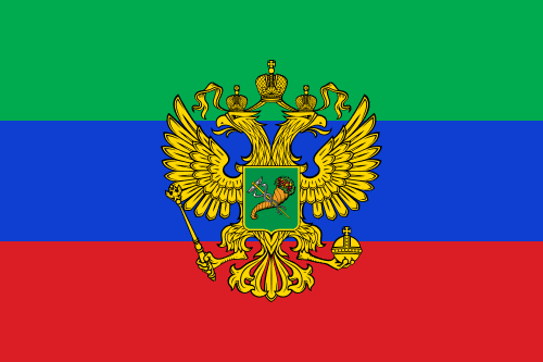
Novorussian Federation?
I've found the following image in social medias, and I immediately became obsessed by it. Since the post about Novorussian flags was one of my most visited ever, I decided to make a post with some of my hypothesis about this image.
The flags for Donetsk, Lugansk and Kharkov republics are well-known by the media. The others, however, are likely to be imaginary flags.
You already know it, but, for this post, it's important that the Russian flag is fresh in your mind, specially the exact sequence of the colors: white-blue-red.
If you look at the table below, you may noticed some patterns:
As I had to redo some flags, here's an all-new map based on the first image, but showing the whole of Ukraine [Crimea disputed area is shown hatched]:
Comments and suggestions are welcome.
The flags for Donetsk, Lugansk and Kharkov republics are well-known by the media. The others, however, are likely to be imaginary flags.
You already know it, but, for this post, it's important that the Russian flag is fresh in your mind, specially the exact sequence of the colors: white-blue-red.
If you look at the table below, you may noticed some patterns:
- All republic flags are tricolor;
- Most of them have two stripes in common to Russian flag showed above;
- No republic flag is directly based in Ukrainian oblast flag, even when it was already a tricolor;
- Ukrainian blue-yellow doesn't appear in any flag [e.g. Dnepropetrovsk].
Oblast | Oblast flag | Republic flag | Source? |
Dnepropetrovsk | Don Cossacks: blue → black Imperial Russia: white → red This variant Russia : white → purple | ||
Donetsk | Russia: white → black | ||
Kharkov | Russia: white → green | ||
Kherson | Russia: red → white | ||
Lugansk | Russia: white → sky blue | ||
Nikolaev | Russia : red → black | ||
Odessa | Possibly inspired by the city of Odessa, very important port during Russian Empire. This variant Russia: white → yellow[?] | ||
Zaporizhia | Kuban People's Republic: change of ratios |
As I had to redo some flags, here's an all-new map based on the first image, but showing the whole of Ukraine [Crimea disputed area is shown hatched]:
Comments and suggestions are welcome.
Subscribe to:
Posts (Atom)