Showing posts with label South America. Show all posts

Dec 26, 2014

Cusco (Peru)

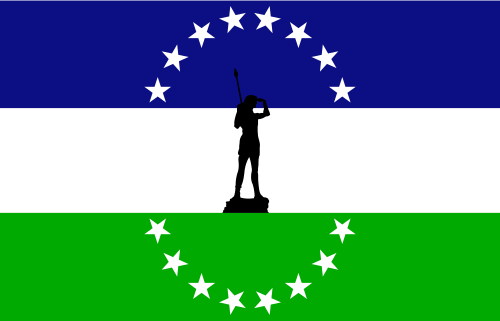
I'm currently backpacking at South America and, as one could expect, a stay in Cusco and Machu Picchu was on the plans. The most curious flag I found so far is municipality of Cusco's.

This is the cusqueña flag:


The only difference between this flag and the current LGBT flag is that the latter has just six stripes, omitting the light blue. Curiously, the interval between the adoption of both flags is about one year, in late 1970s.

But it's is identical to original flag of International Co-operative Alliance (changed in 2001 to a logo-like flag). Most historians reject the ancestral origins of the Cusco flag, but a very curious theory links the flag to cooperative one: the original cooperative flag was proposed by Peruvian feminist Flora Tristán, after visiting a supposed temple dedicated to the rainbow in Peru. So, while the flag is certainly a modern invention, it may be indirectly linked to legitimate Quechua (the main ethnicity of Inca Empire) symbolism.

Due to the similarity with LGBT flag, a flag change was decided in 2007, not without polemics. The expected public consultation still haven't occurred, though.

Comments are welcome!

Oct 31, 2014

Bolivia [naval ensign]

Bolivia is currently a landlocked country, losing its remaining sea cost in the 1879-1883 War of the Pacific (not to be confused with the WW2's Pacific theater). It's surely not the only landlocked country in the world with a navy, but having a distinct naval ensign is certainly curious, specially for its symbolism.

This is the reported naval ensign of Bolivia, created in 1966:

In the canton, you can see national flag of Bolivia; part of its symbolism was briefly addressed in another post. The blue color represents the sea, the nine stars represents the current nine departments of Bolivia. The tenth star, bigger and prominent, is the most dramatic part of the flag: it represents the lost Litoral department (that contained all Bolivian former sea coast) and, at the same time, the hope to once again have a sea access.

Although Bolivia doesn't have, currently, an oceanic fleet, the ensign is commonly saw in Lake Titicaca (the biggest South American lake) and many large rivers.

A variant flag found on photographs is the following:

The colorful checks is a representation of the Wiphala, a flag used by the native Aymara people and, since 2009, a national symbol of Bolivia. Its status is uncertain to me; any additional information is gladly received.

Comments are welcome!

Mar 31, 2014

Union of South American Nations

The Union of South American Nations (UNASUR in its Spanish acronym) is an organization formed by the 12 independent nations of South America (with Mexico and Panama as associate members).

Although apparently unofficial, a flag appears on most of the meetings of the organizations (like that, that occurred this month).


The flag is blue with a white logo. The use of logos on flags is common between international organizations, but may result in bad results, specially if the logo is too abstract or two complex; what's not UNASUR flag's case. The logo, similar to a whirl, remembers the shape of the South American continent. Reported variants have the "UNASUR" word either above or below the logo.

The flag is considerably different from the proposed flag given by Peruvian then-president Alan García to the president of Chile and then pro-tempo president of UNASUR, Michelle Bachelet, on its constitution summit.


The flag presented by García was red, with a golden silhouette of South America inscribed in a golden ring. That flag was inspired by a design by his party's founder, Victor Raúl Haya de la Torre (1895-1979). Haya's design, however, had the map of the whole Latin America instead of South America only.

Comments are welcome.

Nov 19, 2013

Río Negro (Argentina)

Today, we'll review the history of the flag of the Argentinean province of Río Negro and its case of self-plagiarism... or something like this.

Firstly, let me present the flag of the province:

The history starts in 2009, when a contest was made to select the new flag of the province, that was until flag-less.

According to the author, the symbolism of the design is the following: blue stands for justice, and the rivers and lakes, green for hope and the agriculture, the forests and the valleys; white was chosen because it's formed by the union of all the colors; the black canton with thirteen stars represents the thirteen departments (a geographic subdivision) that forms the province. The use of the black color is unclear, but my theory is that it's someway allusive (canting) to the name of the province, that means "black river" in Spanish.

Soon after the flag was designed, many negative critiques appeared, specially with the opinion that black was improper because of its association with mourning. Particularly, I think the flag isn't bad, I only think that black and blue shouldn't be put together because of their similarity.

Graver of the accusations of plagiarism. Firstly, that it was very similar to the flag of the former Kingdom of Araucanía and Patagonia. The kingdom was an attempt, by a French adventurer, to establish a monarchy on southern Argentina and Chile (including part of current Río Negro province) with the support of native Mapuche people, but severely combated by Argentinean and Chilean armies. A more serious claim of plagiarism is related to an unofficial flag that, according to Wikipedia, was used on some deeds by province government. The colors, the stars, all the elements of current flag are there!

Usually, looking for symbols on its own history (is it really self-plagiarism) is not unethical (if you cite the sources, obviously), but is it fair appropriating of someone's work to gain a contest?

What's your opinion about it? Your comment is welcome!

Jun 17, 2013

Hispanicity / Americas

The flag of the Hispanic people isn't widely seen, in spite of its excellent design and the official status it holds in the whole American continent. Looking at it:


The flag has a white colors, representing peace. The three crosses (known as crosses pattées in heraldry) represent the nao Santa María and the caravels Pinta and Niña, the three ships ceded to Christopher Columbus in the discovery of American continent, as well as the Christianity. They are purple, according to the author of the flag, the Uruguayan army captain Ángel Camblor, in reference to the lion of the kingdom of Leon, later annexed to the Crown of Castile, where the Spanish idiom was developed. The sun represents the Inca sun-god Inti, associated in some countries with the May Sun.

This flag is used in Spanish-speaking Latin America, Hispanic communities in North America, and in Philippines, as an ethnic flag of ethnic people. Its use is most commonly flown in Columbus Day. In those occasions, it's also known as "bandera de la raza" (i.e. "flag of the race").

Moreover, it's officially regarded, in all countries of the continent, as the "flag of the Americas" i.e. as a Pan-American flag independently of ethnic identity, since the seventh assembly of Pan-American Conference, occurred in 1933.

As I said, I think this flag should me much more popular, specially in its use as a Pan-American symbol. Although the flag's symbolism is initially associated with Hispanic ethnicity, some may say Columbus is relevant to the history of the whole continent, and that the sun can be represent the concept of "New World" (as America where known before this name was given) and the liberation process of the continent.

Your comment is welcome. Feel free to comment.

Mar 27, 2013

Easter Island (Chile)

Easter Day is next Sunday, and, as I think I won't post again until then, I believe it's an excellent occasion to talk about the very curious Easter Island flag, and try to answer why it hasn't a moai.

The Easter Island is a province of Chile, located in Valparaíso region, constituted by a single namesake commune. The flag of Easter Island is, actually, the flag of rapanui people, although it's widely flown as unofficial flag of both the commune and the province. See it:


Surely no moais. It represents a reimiro, a pectoral ornament whose formant remembers a crescent moon with two characteristic human faces on each extremity or a ship with their own figureheads (reimiros in other shapes also existed). Its meaning and use is unknown, although it possibly was only use by noble women on ceremonial occasions or rituals. It represents, therefore, nobility and authority.

Between 1876 and 1888, this flag was used instead:


The difference in this flag are the four manutaras (Onychoprion lunatus, or spectacled terns), birds with an important role on local mythology.

And why not the moais? To explain it, we should explain the political context where the moai were created. The island inhabitants were divided in two classes: the "long-ears" (the nobles) and the "short-ears" (the commons). Moais were probably made to satisfy the ancestors of the "long-ears"; to made them, the "long-ears" enslaved (yes, it's the correct word) the "short-ears". In the end, during a rebellion, all "long-ears" were killed. And it's the main reason of because the moais are absent of the flags: they are symbol of a shameful past of slavery and oppression, according to the theory of Ron Fischer on its work "Easter Island Brooding Sentinels of Stone".

Happy Easter to all! Feel free to add a comment!

Oct 16, 2012

Element of flags: color palettes

When you're talking about flag, "coincidences" sometimes aren't what they look like. Many times a flag is intentionally similar to another, when the first taking the second as inspiration. An example easy to notice and study are the color combinations. Some flags are very influential, in the sense that's took as base to many newer flags. Here you can see some of them, grouped by the inspiration.

Pan-African colors


There's two palettes of colors known as pan-African colors: one is composed by red, yellow and green, while the other contains red, black and green.

The first set of color (green, yellow and red) is inspired by the flag of Ethiopian Empire.


This three colors have been specially used in Ethiopia since about 17th century, but the flag was only adopted in 1897. The meaning of the colors is disputed, but generally it's said that red is for the blood spilled in defense of Ethiopia , yellow is for the peace and harmony between Ethiopian ethnic and religious groups, and green for hope or land's fertility. The insignia in the middle of the flag is the Lion of Judah, used because the Ethiopian Dynasty claimed to have ancestry from King Solomon and Queen of Sheba, being named Solomonic Dynasty.

As Ethiopia, with exception of a brief period of Italian rule, resisted strongly to European colonization, many countries adopted this colors when gained independence from European countries, as symbol of sovereignty. They are also much used by the Rastafari Movement.

Other set of colors also known as "Pan-African colors" are composed by red, black and green, derived from UNIA (Universal Negro Improvement Association) flag.


The UNIA was founded by Afro-American activist Marcus Garvey, in 1920. It's commonly said that red stands for African blood, black for the African people and green for continent's fertility. It was adopted as an   unofficial "Afro-American" flag and many African countries inspired in it to create their own flags.

Countries in Americas with great African-descendant population, e.g. St. Kitts and Nevis and Grenada, also adopted pan-African colors. See a small flag chart with some African countries with pan-African colors in their flag history:


[Click on images to zoom]

Pan-Slavic colors


Other great flags family is from pan-Slavic. They use the colors red, white and blue. It's important to notice that not all flags with these colors has pan-Slavic inspiration (like France, USA and UK). They are inspired by the flag approved by Pan-Slav Congress of 1848 (occurred in Prague). The colors, associated with freedom and revolution (e.g. French flag) and the same of Russian flag, were chose in a great number of Slavic countries. See the pan-Slavic flag and a flag chart with flags inspired by it.


Pan-Arab colors


Here's a challenge: can you say right now, without assistance, the differences between Kuwait and Jordan flags? You probably don't; if you can, congratulations, because flags of some Arab countries are very hard to be distinguished by non-Arabs. The reason is simple: they all have the same matrix, in this case the flag used during the Arab Revolt (1916-1918). Look at the flag:


The Arab revolt was an attempt to create an unified Arab country under territories of Ottoman Empire (ruled by ethnic Turks). The flag used during the revolt, considered Arab nationalist, was immediately adopted as symbol of Arab identity. See a set of recognized and unrecognized countries that adopt this colors:


It's important to notice that non-Arab Muslim countries, like Afghanistan and Pakistan, don't adopt this colors.

Pan-Iranian colors


Many flags are commonly thought to represent the pan-Arab colors, but actually represents the pan-Iranian colors, used by Persian people, majority in Iran, Tajikistan and Afghanistan. They're based in Persian flag (nowadays Iran); this one is from before 1906 (date unknown).


The small flag chart below show some flags using pan-Iranian colors:


Colors of Federal Republic of Central America


The Federal Republic of Central America (1823-1838) was a good attempt to hold together previous Spanish colonies in Central America, but the union disbanded, although until today they have friendship relationships and there were other attempts of reunification, e.g. the Greater Republic of Central America (1896-1898). See the flag of the Federal Republic:


The color of these flags are blue and white (Costa Rica added the red).


Colors of Gran Colombia


Finally, the last color-based flag family. In a similar case to Central America, the ex-constituent countries of Gran Colombia (officially Republic of Colombia; 1819-1831) adopted the colors of these countries. The unification ideology, influenced by the ideas of liberator Simón Bolívar, is having some voice last years. Gran Colombia used many flags, being the flag below the first and most famous of them:


The colors that defines this family are yellow, blue and red. Bolivia changed the blue by the green. See the flags of this family:


Ending...


This was a long post. Don't you think I deserve at least one comment? Please, if possible, subscribe to the blog. Thank you for reading!

Oct 9, 2012

European Union v. USA and Brazil

Brazilian and American flags have a great problem in common: the number of stars. This post will talk about this issue, and how European Union took the right decision to avoid the problem.


The Brazilian flag is, by far, one of more easily distinguishable: the yellow rhombus on green field is pretty unique between the national flags. The biggest problems with it is the writing, that may ever be avoided in a flag, and a extremely complex set of 27 stars, organized between the most seem constellations in Southern Hemisphere. The number of stars reflects the 26 states and the Federal District. When the flag was first designed, in 1889, the number of stars was 21, as was the number of federated states (counting the Federal District). Since then, the flag have the number of stars changed three times. The stars and the motto makes the flag very complicated to be correctly made.

Now, we'll talk about other extreme case: the flag of United States of America (it's important to note that the first Brazilian Republican flag was inspired in this one):


The national American have is composed of thirteen horizontal stripes (seven are red and six are white) and a  blue canton with fifty stars, representing the fifty American states (the District of Columbia isn't in account). Since the design with stars were firstly adopted, in 1776, the number of stars were officially changed 26 times — the flag has been changed in an average interval of nine years! Positively fifty is a great number to any element of a flag. Compare with the famous "Betsy Ross flag", with only thirteen stars:


Wouldn't be easier if the number of stars were fixed since then? Or if this design returns? Aesthetically, yes, but probably many people would disagree. This kind of solution was adopted by European Union flag, originally adopted by Council of Europe, in 1955.


The flag consists in a blue field, inspired by the flag of Paneuropean Union (see its flag now and then), and twelve golden stars in a golden arrangement. These elements sometimes remembers the way Virgin Mary is depicted in Book of Revelations (see example), but it's hard to know if it was a real inspiration. The first proposal had fifteen stars, because then this was the number of member states of Council of Europe, but one of the members, the Saar Protectorate, was a disputed area, and West Germany objected the start for Saar. So they fixed the number of stars in twelve, because the number symbolizes perfection and has no special political connotation.

What's your opinion about the flags presented there, or the post content? Your comment is welcome!

Oct 2, 2012

Arica y Parinacota (Chile)

Some weeks ago I read a news that gave an idea to a new post on this blog: Microsoft, one of biggest enterprises in the world, changed its logo. Look at the new logo:


You may be thinking: OK, but what this have to do with flags? I can better answer you with a flag: the one of Arica and Parinacota Region, in Chile.


It seems like Microsoft copied Arica and Parinacota logo or, more probably, the creators of the flag predicted some design trends. The two are recent: the province was only created in 2007.

This example shows perfectly that a flag can be a design piece. Unfortunately, this also shows that flag-making rules aren't necessarily identical to design rules. For example, writing is something that somebody with vexillologic knowledge would avoid.

In other hand, this model can be used as problem without major problems: some elements of the place are shown (llamas, a colonial building, a beach and mountains). It's distinguishable and can be used in many occasions (see the regional Manual of Graphic Norms). At least, still this design become old-fashioned: see the flag of Newfoundland and Labrador and you'll know better the problem — being sincere, probably Labrador and Newfoundland flag never looked good.

Thank you for reading. Every comment is welcome.

Sep 9, 2012

Element of flags: The Southern Cross

Today I'll write about the Southern Cross (also know by its scientific name, "Crux"), a symbol present in flags, coat of arms and other design issues from everywhere in Southern Hemisphere. Maybe, you, in Northern Hemisphere, want to know: what do you see in special in Southern Cross? Myself, a Brazilian, could answer: everything.


[Note: This flag is from Cruzeiro do Sul, Acre, Brazil. For me, the simplest demonstration of Crux majesty]
Firstly, it's important what the Southern Cross means: the South, its ancestors and its lands. During the Antiquity, it was visible in southern Europe and other similar locations. But, in the transition to Middle Ages, approximately, the change of Earth axial inclination hided it until, at least, some thousands of years.

The first time the Southern Cross was saw again by an European was in 1500, during the Discovery of Brazil, by Portuguese astronomer João Faras. Since then, navigators adopted the Crux in the same way the land natives was using it since immemorial times: as a reference mark to Southern Pole (my post about Antarctic flags shows one flag refering to this fact). And it's as a symbol of geographic position that the Southern Cross is used in flags, etc. See a small gallery with some of these flags:


[Click on image to zoom]
The Southern Cross is frequently seen in flags of Argentina, Australia, Brazil, Chile, New Zealand, Papua New Guinea, and Samoa, and it's featured in many of Australia and New Zealand proposals to new flags.

I'm a great fan of Southern Cross, but I must to tell a bad note: the Southern Cross is tattooed, in Australia, with a connotation of  nationalism that sometimes comes near xenophobia. However, I think until many Australia recognizes the Southern Cross as the incredible symbol it is.

If you want to give your opinion about the post or the Southern Cross use in flags, feel free to comment. Thank you!

Apr 28, 2012

Tierra del Fuego (Argentina)

Is there a line between which design should be considered exotic in a flag and which shouldn't? It's hard to decide if there is, and harder to say what would be this line. For me, it's just a question about how pretty would be the final result. Why am I saying this? Because the today's flag has a pattern different from any other I know, but it's pretty charming and interesting. Going to the pont, this is the flag:


What's the pattern of this flag? A division with the shape of a albatross silhouette. The albatross isn't just a local bird, but a symbol of freedom too. The orange division is like the stylized form of Argentinian part of Tierra del Fuego (that's shared with Chile), too.

Another thing I like in this flag is the colors scheme. The orange represents fire, because "Tierra del Fuego" means "Fire Land" or "Land of Fire"; accidentally, it's a great color to represent the southernmost part of American continent, because orange contrast really well with ice. The blue is, naturally, for the sky and the sea. The Southern Cross is because, as I said, it's really in the South.

And, moreover, it's a great combination!

Just a little funny note: when I said South, it's really South! The province has claims to Falklands and neighbor British islands, as well to a slice of Antarctic. And the more ironical: would you believe if I say that the Antarctic Treaty office is based in Buenos Aires, Argentina?