Jun 30, 2014

Netherlands [football]

Every time world turn its eyes to football (also known as soccer in North America), some questions arise: "Why Italy use blue?", "Why the Netherlands use orange?", etc. As the Netherlands are still alive in competition, I'll focus today on them.

The Netherlands use orange on his home jersey, and on the official KVVB (Royal Dutch Football Association) online shop, you can find a supporter flags similar to the image below. So, why the orange?

The answer is: this is the color of the House of Orange-Nassau, the royal house of the Kingdom of the Netherlands. Although the Princes of Orange seems to have used the orange fruit as one of their symbols, orange was, curiously, the livery color of the House of Nassau. The original flag of Netherlands was orange-white-blue, but the first was gradually substituted by red along the years.

Several members of the House of Nassau appears on portraits with a orange bend, like this, representing Henry Casimir I of Nassau-Dietz, painted by Wybrand de Geest:

With the foundation of the House of Orange-Nassau, the orange color became a symbol of Dutch royal house. On the royal birthdays, for example, the national flag should fly with a orange pennant above, as a sign of allegiance:

With time, orange was turning from a royal color to a national color, and became a symbol of Dutch pride. Its use was specially remarkable during WW2, when the country was occupied by the Nazi.

You can return watching the World Cup now... Comments are welcome!

Jun 17, 2014

León (Spain)

In many posts from this blog, I've written about flags inspired by coats of arms. On this review, we'll look how curious can be the opposite phenomenon: a coat of arms based on a flag!

The kingdom of León's name comes from "legion", but the pun with "lion" was quickly noticed. While many European kingdoms were fughting the Crusades, the kingdom was fighting against the Moors in its own homeland. For use on the battlefields, the legions used a flag with a purple lion passant on white or light gray cloth, something like this:


As the use of the purple lion by León (first half of 12th century) predates the adoption of the fleurs-de-lis by France, lions by England and the pales by Aragon/Catalonia, it may be, possibly, the oldest royal symbol documented.

With the birth of heraldry, the purple lion would, naturally, fill a coat of arms. And here comes the most interesting part of this story! According to a study by Ricardo Chao Prieto, the Mediaeval idea of horror vacui ("fear of the empty") made the lion passant be rotated 90º degrees, what eventually made it a lion rampant. Look at the image:


Prieto's thesis has some merit: while the lion passant roughly feels one third of the escutcheon, the lion rampant occupies the full shield; England addopting three lions passant guardant may not be coincidence. And, although it may sound unintuitive, a lion rampant looks a lot like a lion passant rotated.

Currently, the flags most commonly used by Leonese nationalists have the coat of arms (the one with the, usually crowned, lion rampant) in a purple or crimson background. This flag arrangement wasn't used during Middle Ages, what points to a more recent origin. Similarly, the Spanish province and city of León currently use the silver shield with the purple lion rampant on background from red to purple.

Comments are welcome!

May 30, 2014

New Russia / Novorossiya, Russia (naval jack)

A new unrecognized nation, Novorossiya (literally, "New Russia"), appeared on Ukraine, claiming territories from Donetsk and Lugansk oblasts. According to current reports, it's unlikely to exist an official flag, but interesting proposals appeared on internet. I'll talk about two.

The first is from somebody nicknamed "arcktick". The photographs skillfully edited on Photoshop may have confused distracted Western sources, that often record them as widely used flags.

According to artist's page, the colors were chosen due to their wide use on Ukrainian oblast flags. Moreover, the flag can be obtained from combinations of Ukrainian and imperial and current Russian flags, as you can see below:

The second is the flag of New Russia Party, a Russophile Ukrainian flag behing the Novorossiya idea. Its flag, backed by many photographs, consists only of the white-blue-red of current Russian flag.

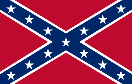
I've saw many Americans noticing the similarity between the flag above and the contemporary Confederate flag, but its most probable origin can be other: the Russian naval jack, below.

This flag consists of the union of St. George's and St. Andrew's cross, like the Great Britain flag, but on reverse order of colors. The naval jack was part of a set of flags designed by czar Peter I the Great himself. At the time, Peter I travelled to many European states, with the goal of forming an anti-Ottoman alliance (he failed) and modernizing Russia, and, on his stay on England, the Union ensign may have inspired him to create the Russian own jack.

But the flag, anyway, has a strong significance to Russia: St. Andrew, having preached along the Black Sea and region, is Russia's patron saint (curiously, Ukraine's, too), and St. George have been Moscow's city patron saint for centuries. The two saints also names important Russian military orders.

Comments (critiques, suggestions, corrections, additional info) is welcome.

May 19, 2014

Book Review: Flags Through the Ages and Across the World (Whitney Smith)

I've recently acquired the monumental Flags Through the Ages and Across the World (1975), by Whitney Smith, Ph.D. considered the founder of the "vexillology" (by the way, this word was created by him), the study of flags. It has more than 350 pages, 2257 artwork pieces made exclusively to the book, , featuring the masterpieces by Franz Coray, and many selected deluxe illustrations and photographs.

It's certainly among the best vexillology books ever written, and, although out-of-date and with minor errors, it's worth any money you can invest on it. The books excels both as a guide to vexillology and as a reference book.

This book is divided in some sections, and I'll describe them one by one.

Introduction (pages 7-31). Contains a brief introduction to the vexillology, and a very complete glossary of terms related to flags and heraldry.

Flags Through the Ages (pages 32-203). For its historiographic valor, the highlight of the book. This section tells the history of the flags since its ancestors ("vexilloids") from five millenia ago until the current usage, including sub-sections related to some historically relevant flags (like the standards of Charlemagne and Joan of Arc), the evolution of flag etiquette, the usage in many contexts (religious, military, naval, etc.) and timelines to some of most famous national flags.

Flags Accross the World (pages 204-303). Describes and explains the flags and coats of arms of all independent nations (and some subnational entities, when relevant) at the time of book conclusion. In the course of time, many of them became obsolete, but this section is yet a relevant text for reference. The section contains appendixes about international flags (like the United Nations and Red Cross) and flags of some ethnic and cultural minorities.

Symbols (pages 304-348). In a very original and intuitive layout, the section cites many flags with common symbols (geometric shapes, animals, plants, etc.) and patterns (the crescent and star, for example).

Apr 29, 2014

Alaska (USA)

Hey, Hollywood, what about a movie about the history of Alaskan flag. It has a rare history for a flag, and it happened on American territory... Well, I did my part.

The history of Alaskan flag starts with Benny Benson, a 13-years old boy with Aleutian blood. When he was three years old, his mother had died, and his father was forced to send his brother and him to orphanage. The year is 1927, and American Legion government is holding a government to decide the first Alaskan flag; more than 700 children from 7th to 12th grades submitted entries.


Benny didn't have doubts about what putting on the flags. The Big Dipper is the constellation that he looked at the sky every single night before sleeping, during all those years in the orphanage. The ratio of the flag, on his original words:
The blue field is for the Alaska sky and the forget-me-not, an Alaskan flower. The North Star is for the future state of Alaska, the most northerly in the union. The Dipper is for the Great Bear—symbolizing strength.
Benny's original design was quite similar to current flag, but had the "1867" inscription on it, that corresponds to the year of the American purchase of Alaska Territory from Russia. A modern reconstruction:


Winning the contest, he gained a US$1,000 prize, a watch and a trip to Washington, DC. He would only waste the money prize some years later, paying a professional course in diesel engines repair. Years on, he moved to Kodiak, Alaska to work as airplane mechanic; city's airport now holds his name.

Hope the history is worth the ticket... I mean, the reading. Comments are welcome!

Apr 18, 2014

World Heritage Convention

You may have seen the today's flag yet. No matter in what continent you live. There's a flag granted to all the UNESCO's World Heritage sites, occasionally also used by the entities that protect te sites.

There are many variants of the flag, but you'll find more commonly these two:


The first, red on white, the second like UNESCO flag (white on UN blue). The inscriptions in English ("WORLD HERITAGE") and French ("PATRIMOINE MONDIAL") are always present, but the writing in Spanish ("PATRIMONIO MUNDIAL") can be replaced by the national language of the country where the site is located.

The square stands for the result of human skills (the cultural heritages), while the circle represents the Earth (the natural heritages). The circle also remembers a bell jar, representing protection (the World Heritage Convention itself). The fact the circle and the square are intrinsically united represents the link between cultural and natural heritages.

The logo of the design has a strong simplicity that combines with a flag. The text, however, could be dropped without extra thought (as in some variants of the flag), because the wind would be too strong or too weak to the text be read on the biggest part of time.

Hope you knew more about this flag. Comments are welcome.

Mar 31, 2014

Union of South American Nations

The Union of South American Nations (UNASUR in its Spanish acronym) is an organization formed by the 12 independent nations of South America (with Mexico and Panama as associate members).

Although apparently unofficial, a flag appears on most of the meetings of the organizations (like that, that occurred this month).


The flag is blue with a white logo. The use of logos on flags is common between international organizations, but may result in bad results, specially if the logo is too abstract or two complex; what's not UNASUR flag's case. The logo, similar to a whirl, remembers the shape of the South American continent. Reported variants have the "UNASUR" word either above or below the logo.

The flag is considerably different from the proposed flag given by Peruvian then-president Alan García to the president of Chile and then pro-tempo president of UNASUR, Michelle Bachelet, on its constitution summit.


The flag presented by García was red, with a golden silhouette of South America inscribed in a golden ring. That flag was inspired by a design by his party's founder, Victor Raúl Haya de la Torre (1895-1979). Haya's design, however, had the map of the whole Latin America instead of South America only.

Comments are welcome.

Mar 16, 2014

Crimea

The flag of Crimea has appeared on many newspapers on last days. This post will not discuss the politics related, but the flag itself.

If you read or watch news recurrently, it's very possible that you have saw this flag:


If you look carefully, the design is rare and curious.The central stripes is too wide compared to whole flag. The reason is it isn't an untouched flag. In 1992, five flag proposals were presented to the Crimean parliament, that chose proposal #5, by A. Malgin and V. Trusov, that was identical to current flag, except for a detail...


Yes, the coat of arms. The white area was originally destined to it, but Crimean parliament decided not to use the arms on the flag, leaving it blank. Vexillology is also made by intentions and should-bes...

I don't know any documents containing the rationale of each of the submitted proposals at the time. While the colors are the same of the coat of arms, it's not clear if the use of Pan-Slavic (or, more specifically, Russian) colors were intentional.

Comments are welcome.

Feb 28, 2014

Asano clan (Japan)

I've recently watched the 47 Ronin (2013) movie, and some flags that appeared on movie attracted my attention. Don't worry, no spoilers!

One of the patterns that appear more often on the movie is, as I was found on my research, the mon of the Asano clan. Asano Naganori was the daimyo of the samurais that would, during the movie, became the forty-seven ronin (masterless samurai) of the title; it was usual to commoners without mon to use those of their patrons or organization. That mon consists of falcon feathers in saltire; falcon feathers were a popular pattern for being used in arrows, and in decoration for some special occasion.

Many flags with this mon appear on the movie, for example on this scene (don't know about historical accuracy). Here's one of those flags I reconstructed:


Japanese mons are used even today as symbol of a family, organization or clan (similarly to Western coats of arms and badges), and are very simple and monochromatic. They commonly appear in architecture, personal marks and, on the age of the samurai, flags, specially during the battles.

The mon were excellent during samurai battles, as their simple designs could be easily used to distinguish friends and foes. As explained on a previous post, the Japanese mon is the base of the Japanese flags tradition.

Comments are welcome.

Feb 17, 2014

Sochi (Krasnodar, Russia)

Winter Olympic Games are occurring right now, and it's a good occasion to review the flag of the Sochi, the host city, that's rarely appearing on media coverage. This flag:


The flag is inspired on the coat of arms of Sochi, that has origins on a Soviet-era coat of arms (later re-adopted, without the hammer, the sickle and other ornaments), therefrom the very abstract representation that's considered bad heraldry. It could be a good logo to a resort city like Sochi, but not a flag or coat of arms.

And what all those thingies on the flag represent? Each quarter represents one of four administrative areas of the city: the snow mountains represent the ski resorts of Adler district; the palm tree represent the Khostinsky district, that includes the biggest arboretum of Russia; the sun represents the Central district an its development, but also the beach season that lasts about ten months; the wavy line represents the Black Sea coast on Lazarev district. On the center of the flag, a bowl of flaming water, representing the spa resort on Matsesta river: Matsesta means "flaming water", because of the skin redness caused by the therapeutic factors present on its waters.

Well, the flag of Sochi leaves the good impression that Sochi is much more than Winter Olympics. We all hope it is!

Comments are welcome.