Feb 28, 2014

Asano clan (Japan)

I've recently watched the 47 Ronin (2013) movie, and some flags that appeared on movie attracted my attention. Don't worry, no spoilers!

One of the patterns that appear more often on the movie is, as I was found on my research, the mon of the Asano clan. Asano Naganori was the daimyo of the samurais that would, during the movie, became the forty-seven ronin (masterless samurai) of the title; it was usual to commoners without mon to use those of their patrons or organization. That mon consists of falcon feathers in saltire; falcon feathers were a popular pattern for being used in arrows, and in decoration for some special occasion.

Many flags with this mon appear on the movie, for example on this scene (don't know about historical accuracy). Here's one of those flags I reconstructed:


Japanese mons are used even today as symbol of a family, organization or clan (similarly to Western coats of arms and badges), and are very simple and monochromatic. They commonly appear in architecture, personal marks and, on the age of the samurai, flags, specially during the battles.

The mon were excellent during samurai battles, as their simple designs could be easily used to distinguish friends and foes. As explained on a previous post, the Japanese mon is the base of the Japanese flags tradition.

Comments are welcome.

Feb 17, 2014

Sochi (Krasnodar, Russia)

Winter Olympic Games are occurring right now, and it's a good occasion to review the flag of the Sochi, the host city, that's rarely appearing on media coverage. This flag:


The flag is inspired on the coat of arms of Sochi, that has origins on a Soviet-era coat of arms (later re-adopted, without the hammer, the sickle and other ornaments), therefrom the very abstract representation that's considered bad heraldry. It could be a good logo to a resort city like Sochi, but not a flag or coat of arms.

And what all those thingies on the flag represent? Each quarter represents one of four administrative areas of the city: the snow mountains represent the ski resorts of Adler district; the palm tree represent the Khostinsky district, that includes the biggest arboretum of Russia; the sun represents the Central district an its development, but also the beach season that lasts about ten months; the wavy line represents the Black Sea coast on Lazarev district. On the center of the flag, a bowl of flaming water, representing the spa resort on Matsesta river: Matsesta means "flaming water", because of the skin redness caused by the therapeutic factors present on its waters.

Well, the flag of Sochi leaves the good impression that Sochi is much more than Winter Olympics. We all hope it is!

Comments are welcome.

Jan 31, 2014

The Forster Flag (USA)

The today's review is dedicated to a flag that will soon be auctioned: the Forster Flag, also known as Forster-Knight Flag, because of its original owner families.

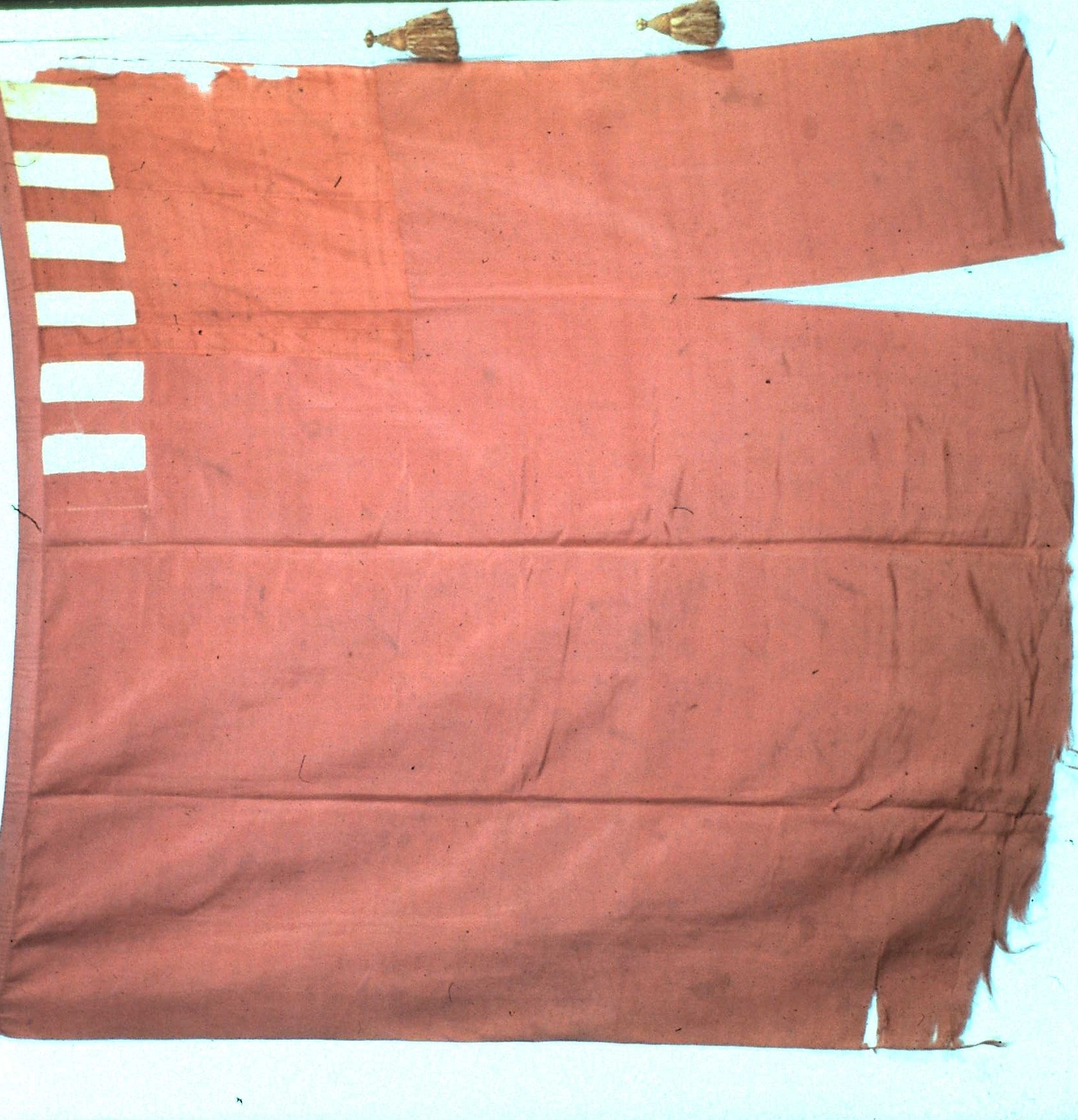
Here's a reconstruction of the flag (a photograph of original flag can be seen here):

It's a crimson field, with six white stripes on left hoist on obverse, and seven on reverse. A difference piece of fabric on canton proves that the flag was made from a red ensign with Union Jack removed. Its overall state is very good to an American Revolution flag, and cord and tassels have survived!

The flag will be auctioned on Doyle New York on April 9th 2014, and its estimate value is between US$ 1,000,000 and 3,000,000. The value seems too high, but a list of facts about the flag, elaborated by vexillology legend Whitney Smith to Flag Bulletin #205 (3rd bimester/2002), can justify it:

  • It's the oldest known American flag i.e. the first flag intended to represent the country;
  • It's the oldest surviving flag to represent America with thirteen red and white stripes;
  • It was carried on the battles of Lexington and Concord, the firsts of Revolutionary War;
  • It's one of 30 surviving flags used by rebel troops during the war;
  • It's one of two surviving Revolutionary flags to replace a British symbol by an American one;
  • Among the 27 war colours on USA, it's the only one that's not owned by a public museum or institution, and its ownership history since Revolutionary days is well established;
  • It was never restored but is still in good state, including the original cord and tassels;
  • It appeared on a 1999 US Post stamp series in tribute to important flags of American history;
  • And much other reasons that can found on link above.

This flag was originally owned by Samuel Forster, lieutenant of Essex Regiment, and was preserved in his family until 1975, when it was acquired by the Flag Heritage Foundation, a non-profit organization and has, since then, been the most valuable item of its collection. Its authenticity was proved many times.

If it's a so important flag, why is it in auction? Only a very good reason would justify it, and there is one: the money will be reverted in benefit to the collection of the own Whitney Smith's Flag Research Center unique and collection to be incorporated by the University of Texas at Austin, what will be very valuable to vexillology research around the world.

I certainly don't have US$ 1,000,000 to pay on a flag, so I can only wait that the future owner knows how to preserve and have good use of this true treasury of American history.

Jan 21, 2014

Stockholm city (Sweden)

Some flags have a really curious history, and Stockholm, the capital of Sweden and biggest city of Scandinavia, is one of those cases that deserves their own "review".

The flag of the city of Stockholm:


You may be asking: "Who's the man on the flag?".

Well, the answer is not that simple. The banner of arms of Stockholm is blue and yellow (Swedish flag colors) with the head of St. Eric, former king and patron saint of Sweden, associated with many popular legends. The arms of the city is inspired by a mediaeval seal of the city. The combination of colors and charges is excellent to denote the importance of Stockholm to Sweden.

So the man on the flag is St. Eric? Don't be so sure.

During the standardization of Stockholm coat of arms, in early 1930s, inspiration were took from a statue on Roslags-Bro Church, that can be saw below.


The curious history about it all is that, currently, that statue is considered to most probably represent another saint: St. Olaf, king and patron saint... of Norway!

Comments are welcome.

Dec 26, 2013

New England (USA)

Ho ho ho! Christmas has passed but its spirit is still on air. Christmas trees, for example, might last until January (by the way, have you ever thought about decorating your Christmas trees with mini-flags?). And few flags are so Christmassy than New England, that's red and white and have a pine tree:

The flag is evidently based on former English red ensign, to be flown, principally, by merchant ships. In Massachusetts Bay Colony, a local variant showed the flag without the cross (i.e. only a red flag with a white canton), because Puritan settlers considered the cross a symbol of "Anti-Christ".

The use of pine trees to represent New England colonies is known as early as 1686, the date of a drawing by lieutenant John Graydon (although there the tree looks like an oak tree). Possibly, the use of pine trees was inspired by "Massachusetts pine tree shilling", accepted as currency on all Northeast. Flags like the one above could be commonly found until 1707, when a proclamation by Queen Anne determined the substitution to British then red ensign. But there are sources that shows flags like this:

The New England flag was revived in 1775, by rebels during American Revolutionary War, purposely without St. George's cross:

This variant, known as "Bunker Hill flag", is often erroneously colored blue instead of red, that generated this a-historical flag copyrighted by Ebinger brothers (you can see my opinion about copyrighted flag here).

A happy 2014 to all blog readers!

Comments are welcome.

Dec 19, 2013

Svalbard (Norway) [proposal]

The Svalbard (or Spitsbergen) archipelago hasn't an own flag. The only flag that regularly flies on the Norwegian territory with less than 3,000 inhabitants is the Norway national flag. The only symbol of the islands is the "coat of arms" of its governor, and there isn't an urgency to adopt an official flag. However, a proposal dating from the 1930s is still unofficially used in the web, and today's post is exactly about it.

The flag proposal looks approximately like this:

The flag in question was initially proposed in a booklet called Fylkesmerker (1930), by Norges Bondelag (Norwegian Agrarian Association), that presented proposals of coats of arms and flags (always banners of arms) for each Norwegian region, some of them adopted with small changes. The only explanation for the design by heraldist Hallvard Trattberg on the book is:
Riksløven på gråverk (heraldisk pelsverk) for å betegne gammelt norsk land.
What means, in English:
Norwegian lion in vair (heraldic fur) to denote old Norwegian land.
In fact, the lion is identical to the one present on Norwegian coat of arms. Although there isn't presented, in my understanding, a clear rationale to background of vair (better blazoned as "vair in fess", in this particular case), my (unsourced) theory is that it's a clever reference to blue and white landscape of this icy archipelago, and a association between a fur (in the case, squirrel fur) and the cold climate. If this theory is true, I think this proposal was very well-though, and could be a winner once Svalbard needed a flag.

Until then, it's only one more flag that exists only on internet..

Your comments are welcome.

Nov 30, 2013

Germany

In this post, you'll see a little more about the history of the German flag on its current and imperial versions.

The first thing to be noticed is that "Germany" is a relatively recent invention, as the Holy Roman Empire lasted until 1806 (being disestablished by Napoleon). A German Confederation was formed in 1815 to substitute the vacuum caused by the end of the Empire, but failed because of the political dualism between Prussia and the Austrian Empire.

However, it was during this period that appeared the ancestral of current German flag, in the context of the Revolutions of 1848, also known as "Springtime of Peoples" or "Spring of Nations", when the black-red-gold flag was used by revolutionaries unsatisfied with the policies of the post-Congress of Vienna. Then the flag was adopted by Confederation between 1948 and 1950.

This flag was a mix of the flag of House of Hapsburg's black-gold Empire of Austria flag, with a red stripe remembering the flags of the Hanseatic cities (important ports of Northern Europe).

The confederation was disestablished in 1867, and substituted, among others, by the Northern German Confederation, that adopted a black-white-red flag:

The color set is a mix of Prussian black and white and the Hanseatic colors (red and white). In 1871, it became the flag of new German Empire.

From this date, the Germans alternated between the two flags. In 1918, the German Empire was substituted by the so-called "Republic of Weimar", that made the black-red-gold its flag. This period lasted until 1933, when Hitler revived the imperial colors for a brief time, when it was substituted by the well-known swastika; the imperial pattern appeared in many flags and emblems of the period, though. With the end of the Second World War, both West and East Germany revived the black-red-gold as the basic pattern to their flags, and it's been used even after the German reunification.

For the end, a curiosity: even although the flag isn't actually "gold", the term "black-red-yellow" or similar isn't used anymore since it was used in a derogatory way by the monarchists and Nazi. The Germans call it "black-red-gold" or, in German, "schwarz-rot-gold". Remember the tip!

Your comments are welcome.

Nov 19, 2013

Río Negro (Argentina)

Today, we'll review the history of the flag of the Argentinean province of Río Negro and its case of self-plagiarism... or something like this.

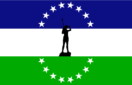
Firstly, let me present the flag of the province:

The history starts in 2009, when a contest was made to select the new flag of the province, that was until flag-less.

According to the author, the symbolism of the design is the following: blue stands for justice, and the rivers and lakes, green for hope and the agriculture, the forests and the valleys; white was chosen because it's formed by the union of all the colors; the black canton with thirteen stars represents the thirteen departments (a geographic subdivision) that forms the province. The use of the black color is unclear, but my theory is that it's someway allusive (canting) to the name of the province, that means "black river" in Spanish.

Soon after the flag was designed, many negative critiques appeared, specially with the opinion that black was improper because of its association with mourning. Particularly, I think the flag isn't bad, I only think that black and blue shouldn't be put together because of their similarity.

Graver of the accusations of plagiarism. Firstly, that it was very similar to the flag of the former Kingdom of Araucanía and Patagonia. The kingdom was an attempt, by a French adventurer, to establish a monarchy on southern Argentina and Chile (including part of current Río Negro province) with the support of native Mapuche people, but severely combated by Argentinean and Chilean armies. A more serious claim of plagiarism is related to an unofficial flag that, according to Wikipedia, was used on some deeds by province government. The colors, the stars, all the elements of current flag are there!

Usually, looking for symbols on its own history (is it really self-plagiarism) is not unethical (if you cite the sources, obviously), but is it fair appropriating of someone's work to gain a contest?

What's your opinion about it? Your comment is welcome!

Oct 31, 2013

Zaire (1971-1997)

Between 1971 and 1997, the Democratic Republic of Congo was renamed to "Zaire" and under the rule of Mobutu Sese Seko, suffered an attempt of "re-africanization".

Politics apart, the flag of Zaire was very nice:


Initially, a noteworthy point is the creative use of the Pan-African colors (red, green and yellow), dissonant in relation to the more abstract and generic depictions. The color palette is completed with brown, what's very understandable considering the ideal of "African" Zaire. This color is rarely found on vexillology, as well as the lighter shade of green used on the background.

The central charge is also very well-thought. On a green background that symbolizes the hope and confidence of the people, there's a golden disc, whose shape represents unity and whose color remembers the natural wealth of the country. In the center of it, the arm of an African man holding a torch, representing the revolution, with a red flame, whose color stands for the blood of the martyrs.

This is a very beautiful piece of graphic art, specially on more stylized depictions like the one above. The flag goes direct to the point of the Mobutu's ideology, without making it overcharged or cryptic, and without a single word being used. Point to the designer!

Comments are welcome!

Please, avoid the political discussion. This is a post about sole vexillology.
It's the 50th post of the blog. I'd like to thank all the readers!

Oct 17, 2013

The "Estelada"

One news [text in Spanish] that called my attention this week was the announcement that a Spanish businessman, called José Antonio Blázquez, "copyrighted" the "estelada", a variant of the flag of the Catalonia, the senyera.

While the common senyera is simply nine-striped yellow and red, the estelada (in Catalan, "starred") has a blue triangle with a white star on the hoist:


This variant of Catalonia flag is used by independentists. Initially, it was supposed that the businessman, that labels himself "Spanish and anti-indepentist", would register the flag only to forbid its use without authorization (that he supposedly won't give), but it's now known that he made it only for the financial exploitation of flag's usage.

My personal opinion, supported by some specialists [text in Spanish] is that the flag couldn't be copyrighted, in legal sense. The businessman claims that a unofficial flag isn't protected for copyright, but it's certainly not the case: a well-known work in public domain can't be copyrighted, because it's considered an usurpation. One could argue that the flag is too simple to be registered, but it's debatable. The specialists predict that the registry will be annulled as soon as disputed and mr. Blázquez won't gain any money for his action.

I believe that the only flags that can be copyrighted are those that contain a copyrightable content (like a logo or an armorial bearing) or other types of unofficial flags (like commemorative flags, for example) that required a considerable level of originality and design knowledge.

What's your opinion about flag copyright? Your comments are welcome.