Nov 20, 2012

Fukui (Japan), Saga (Japan)

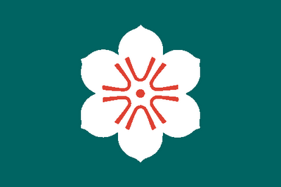
Japanese flags! Didn't you think that Japanese people, always surprising the "Western civilization", would have ordinary flags? Actually it has a rich and consolidated tradition about flags. Let's start with a good example: the flag of Saga prefecture.


It's positively a great flag! I like too much radial symmetry in flags, and it's a great example of it. It's simple, everybody could easily guard all details in memory and after all reproduce them. The flag represents camphor flower, in format of mon (see definition below). The white color represents justice, while red is for passion and loyalty. As a whole, the flag represents "a highly developing harmony".

A "mon" is a stylized figure used as familiar or personal insignia, similarly to Western crests and badges. Click here to confer a gallery of mons.

Now, I'll show the beautiful Fukui prefecture flag, that'll be used to explain other tradition on Japanese flags.


This flag is very colorful, isn't it? Japanese flags are very colorful, usually bicolor or tricolor. Every color can be used in Japanese flags, including some tones that are rare in West, like grey, brown, purple, teal, buff, brownish-green and rose color.

You may be asking yourself "What's this symbol?". This mon is a stylized version of Fukui name transcription in katakana ("フクイ"). A very common technique on these flags is use the name of the entity (or their first syllables) and stylize it as a mon.

I hope you liked the flags and the text. Your comment is welcome, and you're free to ask, suggest, praise, criticize or give your opinion.
Nov 14, 2012

Olympic flag

The Olympic flag is a cultural icon, seen in almost everything related to sports and competitiveness. The flag is shrouded in myths, and I probably couldn't remember all of them, but I'll try to clarify the most famous. It's used since the seventh modern Olympic Games (Antwerp, 1920), although it is some years early (remembering that 1916 Olympics didn't occur). Its creator is Pierre de Coubertin, the founder of modern Olympics. It's the flag:


The five rings represent more probably the five continents. The position and color of each meaning is defined.

OK, coming to the myth #1: each color represents one continent. The answer is: depends... Although  it isn't the original meaning, it appears in the Olympic official handbook. There's even an official explanation to the colors: blue for Europe, yellow for Asia, black for Africa, green for Oceania and red for Americas.

Myth #2: the rings are based in ancient symbols found in Delphi. Absolute myth, but there's a funny explanation to it! Before the 1936 Olympic games, the torch passed in Delphi. To commemorate the occasion, a milestone was constructed and put on the Delphi ruins. It was never removed, until two British historians found it in 1950, creating a great confusion.

So let me tell what's almost certain about the origin of Olympic symbols. The rings are inspired by the logo of USFSA (the French Olympic representative), where Pierre de Coubertin took part and could easily borrow the symbol. About the colors (including white background), they came from the national flags of each country that competed on that time. See a quote by Baron de Coubertin, in 1912:
...the six colours [including the flag’s white background] thus combined reproduce the colours of all the nations, with no exception. The blue and yellow of Sweden, the blue and white of Greece, the tri- colours of France, England and America, Germany, Belgium, Italy, Hungary, the yellow and red of Spain next to the novelties of Brazil or Australia, with old Japan and new China. Here is truly an international symbol.
Would he joke? The "color-for-continents" theory isn't truth, so you can't absolutely say "yes" or "no".

This is it. I hope you liked the text. Please, leave your comment (positive, neutral or negative).

Nov 7, 2012

Norway

Today I'll talk about Nordic cross flags. After all, what are their magic? The example I chose isn't the older Nordic cross flag (Denmark adopted its flag in 1219), but I personally prefer three color Nordic crosses, and Norway flag is the older in this aspect (1821). Pay attention on this beautiful flag:


About the meaning, nothing too special: blue, white and red were the colors used by France and USA, countries that, at time, were considered democracy and freedom examples. There's a theory saying that red is for Denmark and blue for Sweden, two countries Norway has important historic relationships. Anyway they're perfect together in a Nordic cross.

Returning to the question I asked on the started of this text: why Nordic crosses are so special? They're highly geometric, what takes a lot of points; they're on limit between symmetry and asymmetry, what makes them sound enigmatic — and enigmas, of course, attracts human brains.

Oh, let me talk a little about the origin of Nordic cross flags. As I said, the first was the Danish flag, that, according to the legend, fell from the sky, what doesn't explains too much. But, if you observe, if flown vertically (and they are, when used as gonfalones), they form a Latin cross [✝], an obvious reference to Christianity — some flags, including Norwegian one, explicit this reference on official explanations.

I made this post to compensate the absence last week. I know you probably like Nordic crosses (everybody likes), so what about tell more about it on the comments? Thanks in advance.