Apr 30, 2015

Church pennant (United Kingdom, Netherlands)

Church pennants are used in warships to denote, usually, that its staff is on religious service or funeral. In signal of respect, it's avoided to send any kind of messages to ships flying the church pennant, except in emergency.

Today I'll present one interesting flag mystery: Why are the British and Dutch church pennants identical? They look like this:


In both countries, the pennant is constituted by St. George's cross in the hoist and Dutch tricolor in the fly. Its use is reported as early as the 1670s.

But why the Dutch church pennant is identical to British church pennant, after all? A version tells that, at least once during the Anglo-Dutch Wars (second half of 17th century), both sides agreed on a temporary cease fire to religious services. Unfortunately, there's no confirmation if it's truth or myth.

A different version says that it's linked William of Orange's flag as King of England (William III), here on a reconstruction by Klaus-Michael Schneider:


Whatever is the origin, it's nice to notice how it survived in both sides of the North Sea to our days. (Just notice how it still used English instead of British flag.)

Comments and suggestions are welcome!

Mar 31, 2015

Māori people (New Zealand)

Now and then, the flag of the Māori, native Polynesian people from New Zealand, appears in media. These time, in the course of NZ flag debate, due to the upcoming referenda — even tough that design probably won't be considered, as it originally represents an ethnic group of the country, not the country as a whole.

This is the most famous Māori flag:


The colors of the flag — black, red (actually, red ochre) and white — are the official colors of the country, what many people out of the island don't know. The color symbolism in the flag is very significative: the black color presents the Te Korekore (the absolute nothingness) and Rangi (the heaven, the sky-father); red represents Te Whei Ao (coming into being) and Papatuanuku (the earth-mother); white stands for Te Ao Marama (realm of being and light), purity, enlightenment and harmony.

The design thus symbolize the Māori creation myth surrounding Rangi (the sky-father) and Papa (the earth-mother), as well as an ideal of harmony, in a very graphic and elegant way. The spiral pattern is similar to a koru and can remark the New Zealand's name in Māori language: Aotearoa, "the land of the long white cloud".

This flag is known as Tino rangatiratanga, an expression hard to be translated, but often did as "absolute sovereignty". This flag was designed by Hiraina Marsden, Jan Smith and Linda Munn, in 1990.

As I said in first paragraph, I have no hopes that it will become the next NZ flag, but the vexillologist inside myself would be more than happy if a design as beautiful as this was chosen.

Comments and suggestions!

As soon as the designs chosen for the referenda were announced, I'll return to the trend.

Feb 28, 2015

Ireland, India

You may have noticed that both India and Republic of Ireland national flags are green and orange. But there are much more coincidences among the flags.

The tricolor flag of Republic of Ireland dates back from the first half of XIX century, but was revived for the Easter Rising (1916) and the Irish War of Independence soon after.


The orange represents the Protestantism (a reference to King William III of Orange, that inspired many Protestant banners), while the green represents the Catholicism (associated with Gaelicism). The white standed for the peace between that two religions...
Society of United Irishmen*Order of Orange

A peace that wouldn't last much. The Protestant-majority Northern Ireland opted to remain in United Kingdom while  the Catholic-majority remaining of the island gained the independence. Since then, the relationship between nationalists (that want Northern Ireland to join Republic of Ireland, usually Catholics) and unionists (that want it to remain in UK, usually Protestants) had ups and downs.

The flag of India was adopted in 1947. It's almost identical to the then-flag of Gandhi's party, the Indian National Congress, but with spinning wheel replaced by a Ashoka Chakra, representing the law and dharma.


The colors were chosen based in the most important religions of India: orange (officially described as "saffron") for Hinduism (probably borrowed from Maratha Empire), green for Islamism (probably taken from Mughal Empire) and white for the remaining religions.
Mughal Empire*Maratha Empire*

The flag, however, gained new symbolism. In the words of Sarvepalli Radhakrishnan, that would later became the second Indian president:
Bhagwa or the saffron colour denotes renunciation of disinterestedness. Our leaders must be indifferent to material gains and dedicate themselves to their work. The white in the centre is light, the path of truth to guide our conduct. The green shows our relation to (the) soil, our relation to the plant life here, on which all other life depends. The "Ashoka Chakra" in the centre of the white is the wheel of the law of dharma. Truth or satya, dharma or virtue ought to be the controlling principle of those who work under this flag. Again, the wheel denotes motion. There is death in stagnation. There is life in movement. India should no more resist change, it must move and go forward. The wheel represents the dynamism of a peaceful change.
The hope for an united India was short-lived: mainly-Muslim Pakistan (later divided in Pakistan and Bangladesh) wouldn't stay much time in the union, and the relationship between the two countries wouldn't be always friendly.

So similar in look, so similar destiny...

Comments and suggestions are welcome.

* Historical reconstructions.

Jan 21, 2015

Novorussian Federation?

I've found the following image in social medias, and I immediately became obsessed by it. Since the post about Novorussian flags was one of my most visited ever, I decided to make a post with some of my hypothesis about this image.


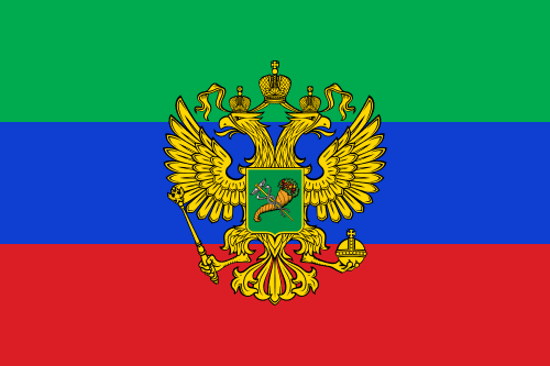
The flags for Donetsk, Lugansk and Kharkov republics are well-known by the media. The others, however, are likely to be imaginary flags.

You already know it, but, for this post, it's important that the Russian flag is fresh in your mind, specially the exact sequence of the colors: white-blue-red.


If you look at the table below, you may noticed some patterns:
  • All republic flags are tricolor;
  • Most of them have two stripes in common to Russian flag showed above;
  • No republic flag is directly based in Ukrainian oblast flag, even when it was already a tricolor;
  • Ukrainian blue-yellow doesn't appear in any flag [e.g. Dnepropetrovsk].
I must remember the column "Source?" shows only my hypothesis, so they may not necessarily correspond to reality.

OblastOblast flagRepublic flagSource?
DnepropetrovskDon Cossacks: blue → black
Imperial Russia: white → red

This variant
Russia : white → purple
DonetskRussia: white → black
KharkovRussia: white → green
KhersonRussia: red → white
LuganskRussia: white → sky blue
NikolaevRussia : red →  black
OdessaPossibly inspired by the city of Odessa, very important port during Russian Empire.

This variant
Russia: white → yellow[?]
ZaporizhiaKuban People's Republic: change of ratios

As I had to redo some flags, here's an all-new map based on the first image, but showing the whole of Ukraine [Crimea disputed area is shown hatched]:


Comments and suggestions are welcome.

Dec 26, 2014

Cusco (Peru)

I'm currently backpacking at South America and, as one could expect, a stay in Cusco and Machu Picchu was on the plans. The most curious flag I found so far is municipality of Cusco's.

This is the cusqueña flag:


The only difference between this flag and the current LGBT flag is that the latter has just six stripes, omitting the light blue. Curiously, the interval between the adoption of both flags is about one year, in late 1970s.

But it's is identical to original flag of International Co-operative Alliance (changed in 2001 to a logo-like flag). Most historians reject the ancestral origins of the Cusco flag, but a very curious theory links the flag to cooperative one: the original cooperative flag was proposed by Peruvian feminist Flora Tristán, after visiting a supposed temple dedicated to the rainbow in Peru. So, while the flag is certainly a modern invention, it may be indirectly linked to legitimate Quechua (the main ethnicity of Inca Empire) symbolism.

Due to the similarity with LGBT flag, a flag change was decided in 2007, not without polemics. The expected public consultation still haven't occurred, though.

Comments are welcome!

Nov 24, 2014

Palestine [Larousse (1939)]

Last weeks, an image has been circulated in the internet, spreading a lot of lies. It's a photograph of the flags appendix of the 1939 edition of Larousse Encyclopedia [click to zoom]:

What's so polemic about it? In the second page, third row, third column, iy's possible to see a flag labelled as "Palestine", whose design is like below:

Many people have argued that it's an ultimate proof that, before United Nations, the British Mandate of Palestine had already a Jewish character. Firstly, it's not an absolute proof: although the Larousse is usually one of most reliable encyclopedias, its flag appendix isn't. In the same image, you can see other wrong flags, like that of Morocco and Soviet Union. Actually, the supposed Palestine flag also appeared in the 1933 edition, also unreliable.

But isn't still possible that this flag flew in the British Mandate of Palestine? Probably not. The only flag officially flown on the Mandate, apart from the Union Flag, was its civil ensign:

But they should have taken this flag from somewhere, shouldn't they? Yes, they should, but they could have invented as well. It's chronologically possible that this flag was inspired by the proposed flag of the 1924 Jewish Cultural Congress:

But the British Mandate of Palestine was still predominantly Jewish, wasn't it? Well, I'm not a specialist in the matter, but the Mandate also included the area of current Kingdom of Jordan, and, with the restrictions on Jewish immigrants, it's unlikely. Sorry, Internet...

Comments are welcome.

You can alo check the Flaglog post.

Oct 31, 2014

Bolivia [naval ensign]

Bolivia is currently a landlocked country, losing its remaining sea cost in the 1879-1883 War of the Pacific (not to be confused with the WW2's Pacific theater). It's surely not the only landlocked country in the world with a navy, but having a distinct naval ensign is certainly curious, specially for its symbolism.

This is the reported naval ensign of Bolivia, created in 1966:

In the canton, you can see national flag of Bolivia; part of its symbolism was briefly addressed in another post. The blue color represents the sea, the nine stars represents the current nine departments of Bolivia. The tenth star, bigger and prominent, is the most dramatic part of the flag: it represents the lost Litoral department (that contained all Bolivian former sea coast) and, at the same time, the hope to once again have a sea access.

Although Bolivia doesn't have, currently, an oceanic fleet, the ensign is commonly saw in Lake Titicaca (the biggest South American lake) and many large rivers.

A variant flag found on photographs is the following:

The colorful checks is a representation of the Wiphala, a flag used by the native Aymara people and, since 2009, a national symbol of Bolivia. Its status is uncertain to me; any additional information is gladly received.

Comments are welcome!

Oct 18, 2014

Italy [jack]

A jack is a naval flag flown by warships and other vessels at the head of a ship. On today's post, we'll see the curious Italian jack.

That jack is very different from Italian flag:


This flag contains four quarters, each one representing, respectively, one of the main Italian "maritime republics" or thalassocracies (from Greek, "rule of the sea"): Venice, Genoa, Amalfi and Pisa.

  • Venice is represented by the Lion of St. Mark (symbolism from Revelation 4:7), because it's believed that the body of the evangelist rests in the cathedral of that city.
  • Genoa was the first of many Northern Italian cities to adopt the St. George's cross, but probably there isn't connections between that and the St. George, even though he's patron saint of Genoa.
  • The Amalfi's is very similar to Maltese cross (but with blue background instead of red), and it's possible that the former predates the latter: merchants from Amalfi founded the hospital where the Order of St. John (Knights Hospitaller) was based.
  • The cross of Pisa was granted by pope Benedict VIII to the fight against Saracens in Sardinia.

While the anverse of the flag shows St. Mark's lion's head, the reverse shows his tail...


Additionally, the merchant vessels politely flies a jack without the sword. The open book reads "Pax tibi Marce, evangelista meus" ("May peace be with you, Mark, my evangelist"), what, following the tradition, an angel said to Mark when pointing his burial place at Venice.


Comments and suggestions are welcome.

Sep 21, 2014

United Kingdom without Scotland [fictional]

September 18th, 2014. That day, Scotland had the change to vote for its independence from United Kingdom, in a referendum. In the breakfast of the next day, the votes count confirmed the "No". However, in the upcoming weeks, there were many predictions about a hypothetic United Kingdom without Scotland, including the flags.

Among those flags, one of the most commonly found was the following:


How is this design done? Pick the current flag and remove the blue. But, differently from popular knowledge, it's not 100% free of "Scottishness".

As I antecipated in this article, the strange look of St. Patrick's cross (the red saltire i.e. diagonal cross) is due to its merge with Scottish St. Andrew's cross. What a parcel of media forgot was that, without Scottish saltire, the flag would look like this:


This layout is, by far, bolder and more equilibrated. Obviously, many other design could be taken into consideration, and media did it; some of them kept the blue, others added elements to Wales and, more rarely, Cornwall.

Comments are welcome!

Aug 31, 2014

Tonga

If you had to choose a flag to be used forever, unchanged, how would it look like? Tonga made its choice already.

This is the flag of Tonga:


Since the 1840s, European missionaries arrived in the islands with the goal of converting the natives to Christianity. They were successful: according to last census, more than 90% of the population profess a branch of this religion.

When the first king of Tonga converted to Methodism, he adopted a flag consisting of a red cross on a white field, representing purity.

The flag was changed in 1866, putting the old flag as a canton of the red field, representing the Blood of Christ shed on crucifixion. A reason commonly attributed to the change was the fact it was identical to the White Cross' flag, adopted by the Geneva Conventions two years earlier. It's not clear if the similarity with a British red ensign was intended or not, since Tonga was then a British protectorate.

According the current Tonga constitution act, from 1875, this flag "can never be altered" and "shall always be the flag". Obviously, the flag could be changed after a new constitution. As this flag doesn't have political signs, the only reasons I can think to replacing it is either Christianism losing relevance on the country or people bore with this bold and elegant design. None of them seems near to happen, so it's a good bet if this flag lasts forever...

Comments are welcome!